Feature Card Sierra
overview
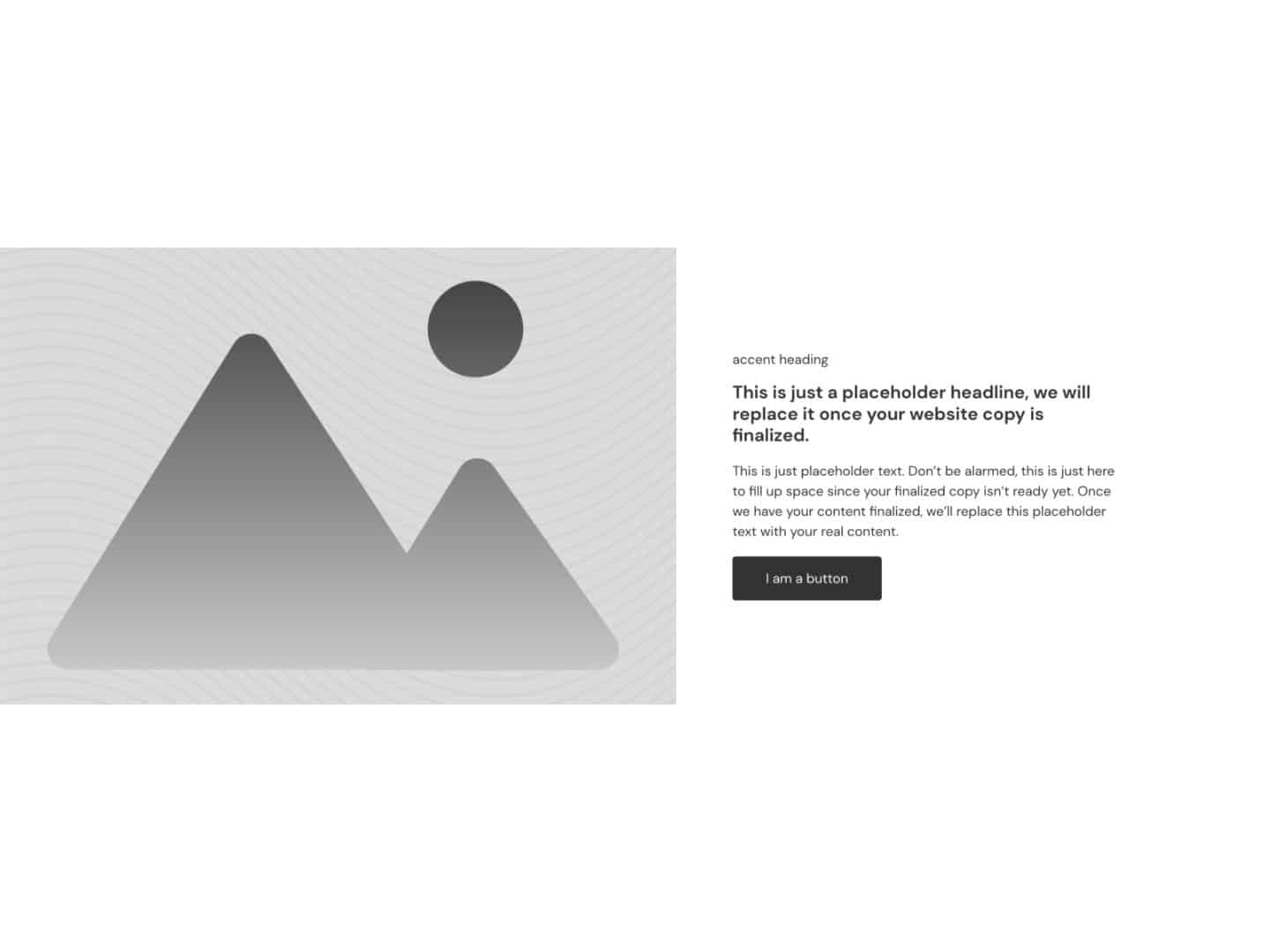
A page-width feature card with an image that breaks out to the viewport’s edges.
Overview
Feature Card Sierra is a page-width feature card with special powers. Its image breaks out to the edge of the viewport.
When combined with Feature Grid Sierra, creating automatically alternating feature cards that appear full width while maintaining proper page-width content alignment is easy.
Frame Created on February 27, 2023
Frame Last Updated on November 1, 2023
Variables
FAQs
How do I flip the order so that the first card starts with text on the left and image on the right?
Easy! Click on the grid and make sure the
.fr-feature-card-sierraclass is active.Open the CSS tab and find this code:
/* Grid Alternating */
root > *:nth-child(odd) > *:last-child {
   order: -1;
   justify-content: flex-end;
}
root > *:nth-child(even) > *:last-child {
   order: 0;
   justify-content: flex-start;
}
All you have to do is swap the odd and even parts of the statement:
/* Grid Alternating */
root > *:nth-child(even) > *:last-child {
   order: -1;
   justify-content: flex-end;
}
root > *:nth-child(odd) > *:last-child {
   order: 0;
   justify-content: flex-start;
}
You’re all set!
Use the related frames section above to check FAQs for other frames related to this frame if you don't see your question here.