The Frames modal allows you to display custom content in a triggerable modal without limitations on design or layout.
The Modal can be used for CTAs, forms, profile cards, menus, galleries, and any other modal-based content, both static and dynamic.
We’ve put a lot of work into making the modal one of the easiest to add, configure, style, and use while ensuring it follows all possible accessibility standards.
Activating the Modal
To use the Frames Modal, you need to activate it in the ACSS dashboard. Navigate to the Frames tab and then toggle the Modal on.

Once you’ve activated the Modal, it’ll be available to add to a page inside the builder.
Adding the Modal to a Page (Bricks)
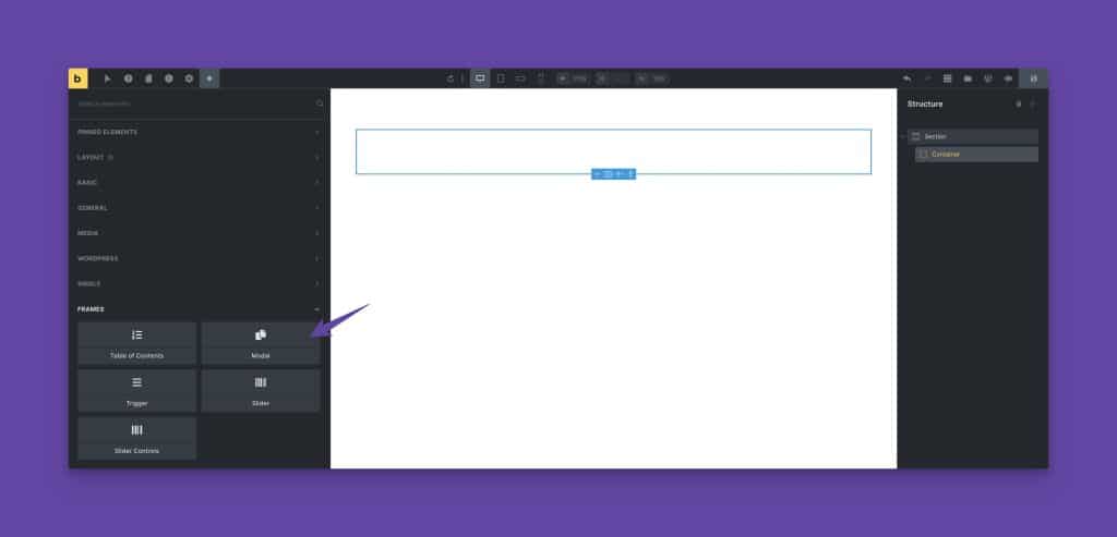
To add the Modal to a page, open the builder and click the plus sign to add a new element. Choose Modal from the side panel under the Frames section.
Showing or Hiding the Modal in the Builder
Since the Modal takes z-index priority, it will cover other content inside the builder. When you’re done working on your Modal and want to go back to editing page content that exists outside the Modal, toggle the switch to hide the Modal in the builder:
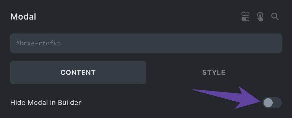
Even though the Modal is hidden in the builder, it’s still functional on the front end.
Adding Modal Content
Treat the Modal like any other container in the builder. Any elements that can be added to sections and containers can also be added to the Modal. Just make sure you nest them inside the Modal.

Modal Overlay Styling
By default, the Modal uses black transparency for the overlay color. To change this, click on the Modal overlay settings panel swatch.

You can use any color from your existing color library, color variables, or any valid color value. If you still want to see page content through the overlay, make sure you choose a transparent color.
Positioning the Modal Relative to the Page
To position the modal relative to the page or browser window, select “Page” from the “Position modal relative to:” setting.
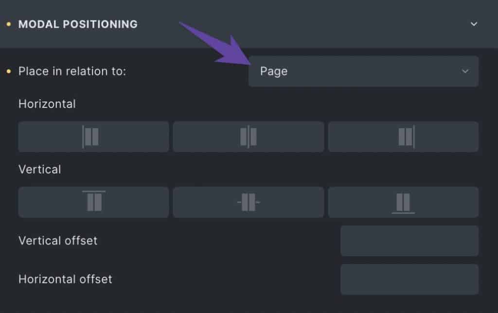
The Modal is positioned in the center of the screen by default, but this is easily editable.
In “Modal Positioning” panel and use the Horizontal and Vertical positioning controls. These controls allow you to position the modal top left, top center, top right, middle left, middle center, middle right, bottom left, bottom center, or bottom right.
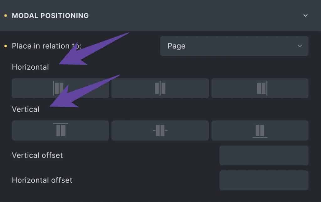
Once you have the modal in the desired position, you can control its offset from the edge of the browser window using the Offset inputs:

These inputs accept ACSS variables or any valid spacing value.
Positioning the Modal Relative to its Trigger
A unique feature of the Modal component is that it can be positioned relative to the element that triggers it.
To use this feature, make sure you’re only using one unique trigger per page and select “Trigger” from the “Place in relation to:” setting.

Next, choose whether the modal to appear above (top) or below (bottom) the trigger:
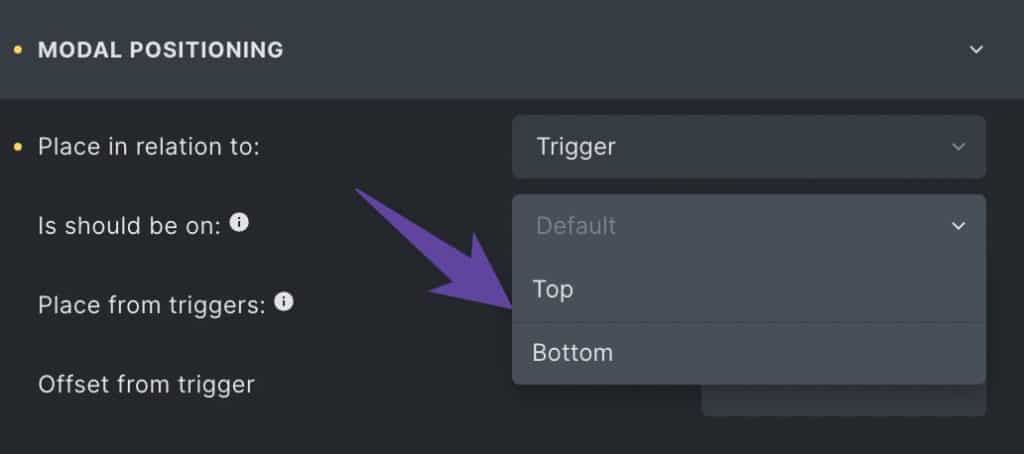
Next, decide the secondary position of the modal relative to the trigger:

Your options are:
- Left side – The Modal will show up to the left of the trigger.
- Right side – The Modal will show up to the right of the trigger.
- Center – The Modal will center itself relative to the trigger.
- Full page width – The Modal will span the full width of the browser (requires you to set modal width to 100%).
- Full container width – The Modal will span the full website content width (will override other width settings).
Lastly, set an offset. This is the amount of space between the Modal and the trigger.
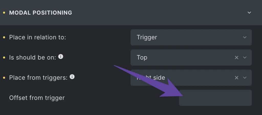
Default Modal Body Styling
The default Modal container has padding by default as well as a background color of white. Both of these defaults are customizable.
You can set a new Modal background color using the Background Color swatch in the Body Container panel.
Additionally, you can change the Modal padding using the Padding inputs. Clearing out the padding or replacing the values with “0” are valid ways to eliminate the default Modal padding.
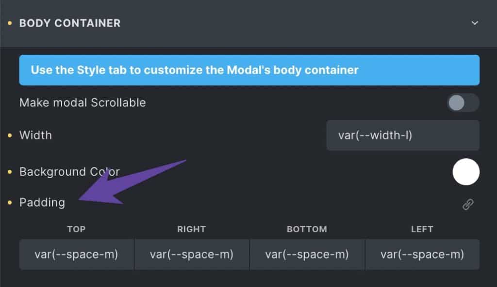
You can set borders, radius, and other modal styling using the builder’s default “Style” controls.
Triggering the Modal
Once you’ve added content to your Modal, create a trigger. The user will use the trigger to open the modal. We recommend one of three types of triggers:
- Button
- Link
- Trigger Component
Add the button, link, or Trigger component to your page and set its destination URL to “#”. Next, we need a way for the trigger to communicate with the modal. This is done using a CSS class.
You get to decide what the class name will be. We recommend using something contextually obvious but not too generic. Remember, you might have more than one modal, so you need to distinguish between them.
For example, let’s say you’re creating a contact form modal. We would recommend a class like .trigger--contact-form.
If all your trigger classes start with “trigger,” it’ll keep everything organized and easy to find.
Add the class to your button or link, and then reopen the Modal settings. Find the Trigger Selector input and put your trigger class in the input field.

Your modal is now listening for a click on this class and will open when your trigger element is clicked.
Note: If your modal is inside a query loop, the triggerable element should be *inside* the query loop as well. If you try to put the trigger on the query loop item itself, the modal will not trigger.
Closing the Modal
The Modal comes with a default close button. This allows user to close the modal. Since the modal is accessible, the user can also close the modal by hitting escape on the keyboard.
The first decision you must make is whether you’ll use the default close button. If you want to create and position your own close button, you can easily do that. Just turn off the default close button to remove it:
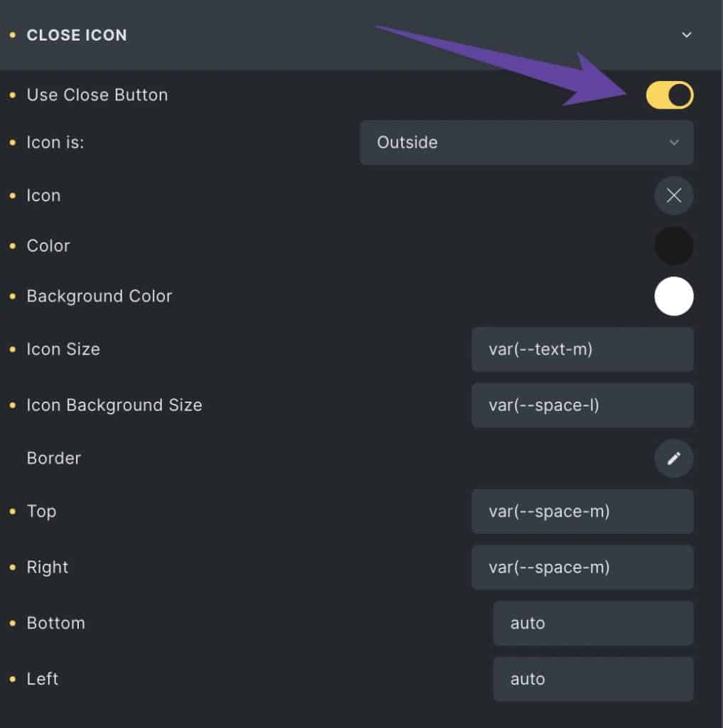
If you want to keep the default close button (recommended), decide whether you want it positioned outside the modal (positioned relative to the viewport) or inside the modal (positioned inside and relative to the modal container itself).

Next, you can position it using the Top, Right, Bottom, and Left positioning controls. These controls work just like relative, absolute, and static positioning controls.
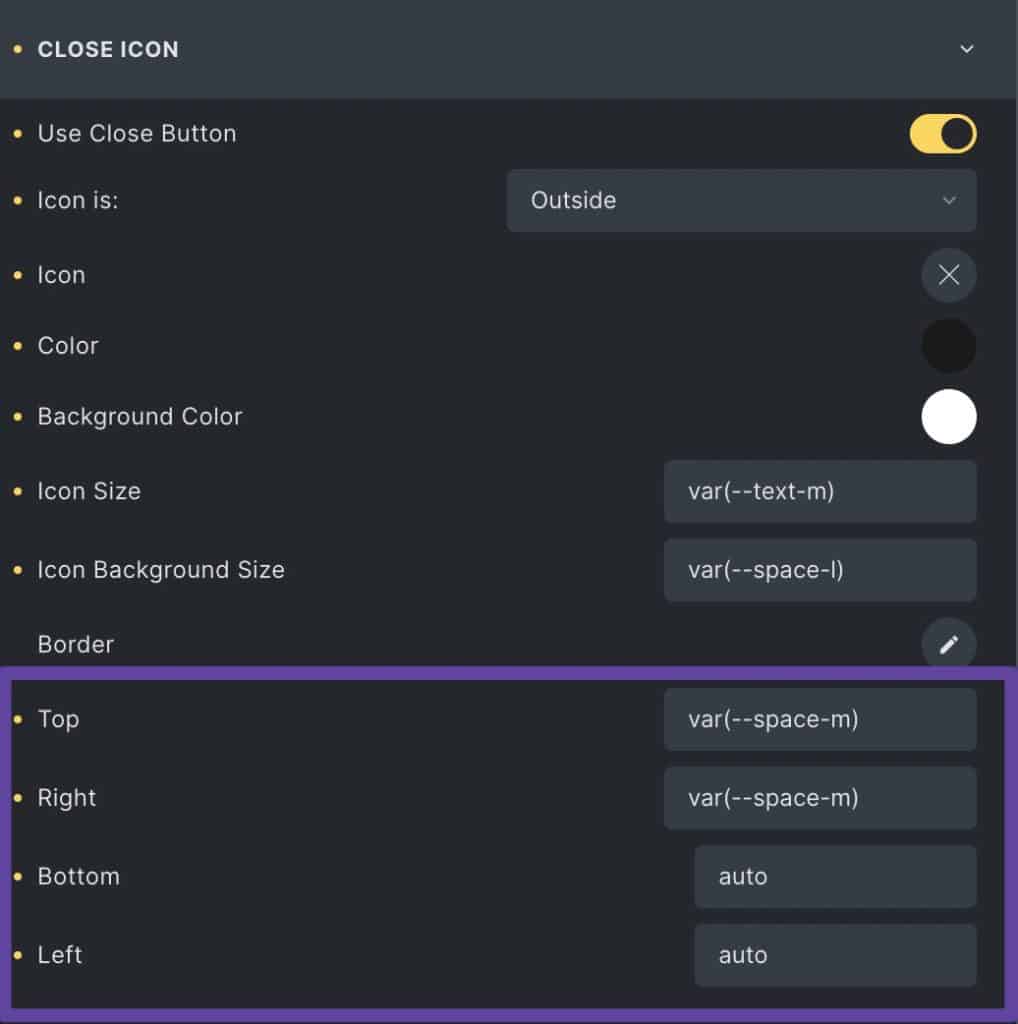
Additionally, you can change the icon, color, background color, size, and background size using the inputs in the Close Icon panel.
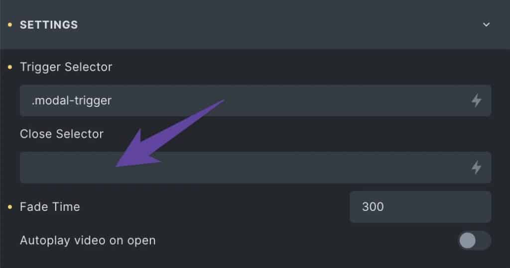
If you decide to use your own close button, you need to set a listener class on it (e.g. .close-modal). Then add the same listener class to the Modal settings area:
Using the Modal in a Query Loop
The Modal is fully compatible with query loops, allowing you to render content dynamically in the Modal. All you have to do is ensure the Modal is appropriately positioned in the DOM/structure panel:
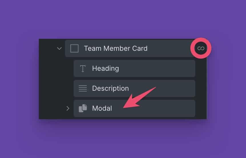
Notice that the Modal is nested as a child of the looped element.
Once the Modal is inside a loop you can dynamically insert any content associated with that looped item (e.g., WordPress post data or custom field data).