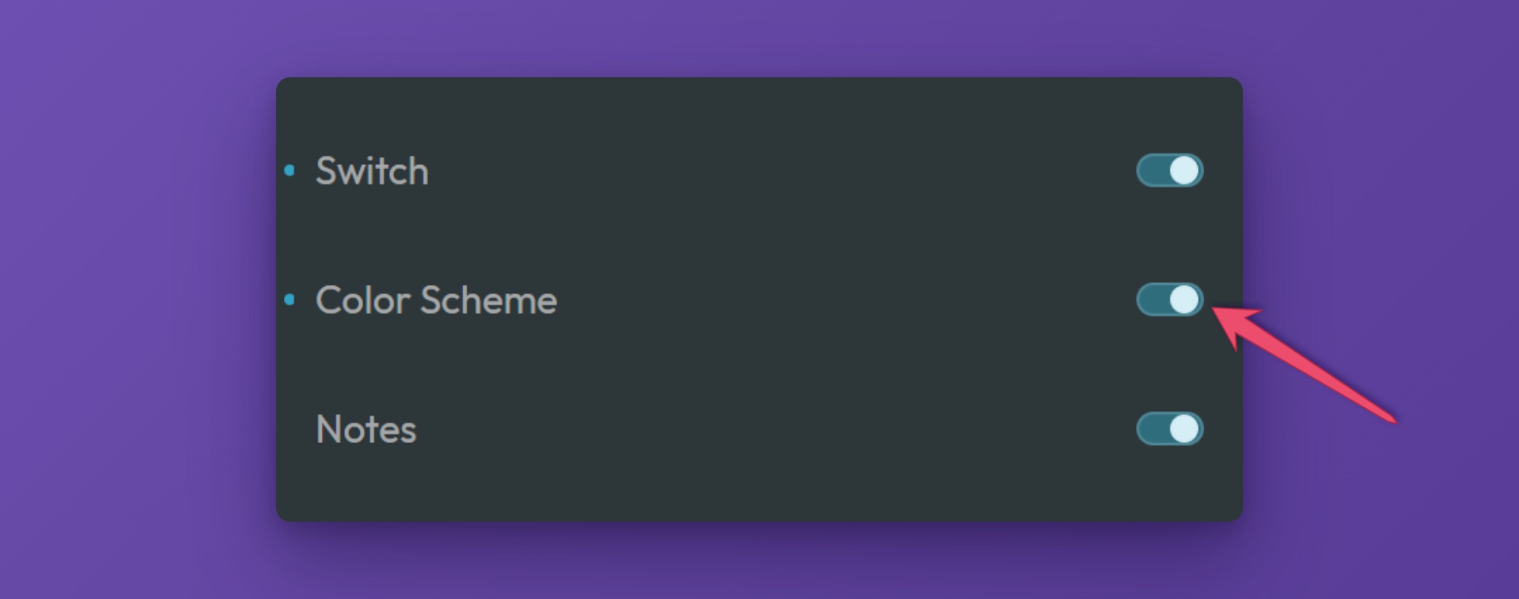
The Frames Color Scheme Toggle lets your visitors switch between a light and a dark version of your site. It comes in two forms: a switch with a sliding ball, or a single button with an icon that changes from a moon to a sun.
The toggle itself only flips the color scheme on and off and remembers the choice. How the page looks in the other scheme is decided by your colors in Automatic.css, so set those up first.
Before You Start
The Color Scheme Toggle works together with the color scheme feature of Automatic.css (ACSS). When a visitor uses the toggle, the following happens:
- The class
color-scheme--altis added to or removed from thehtmlelement of the page. - The choice is saved in the browser of the visitor (in local storage under
acss-color-scheme), so the page opens in the same scheme the next time.
Your ACSS color settings decide what the alternative scheme looks like. If the page does not change when you click the toggle, check that your dark (or light) colors are set up in the ACSS dashboard. The toggle also reads from ACSS which scheme your site uses as its main one, light or dark.
To use the Frames Color Scheme Toggle, make sure it is switched on in the Components panel of the Frames tab in the ACSS dashboard.
Adding the Toggle to a Page (Bricks)
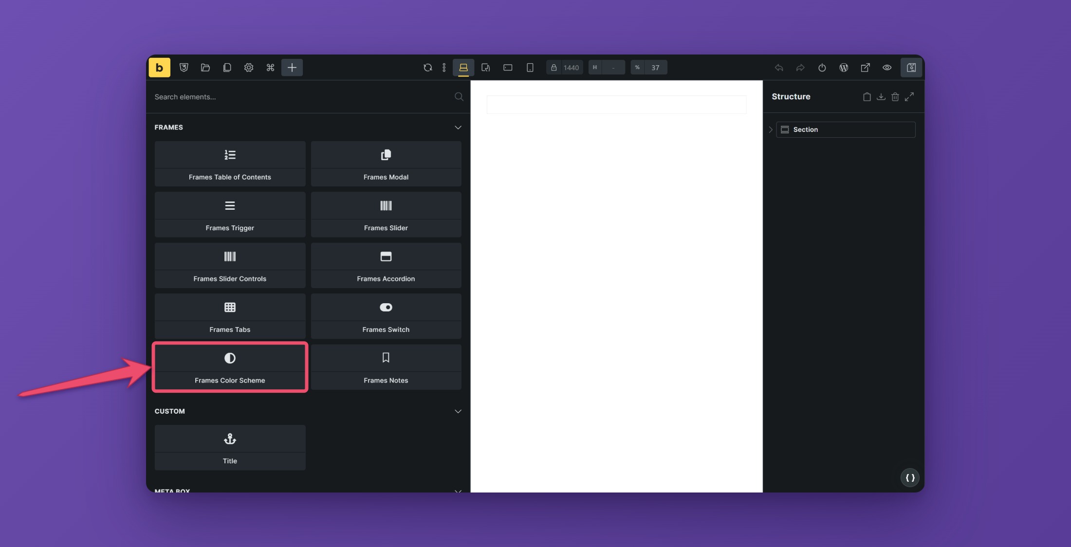
Open the builder, click the plus sign to add a new element, search for “Color Scheme”, and choose Frames Color Scheme from the Frames section. A good place is the header of your site.
The element has two modes. Choose the one you want with the Mode setting.
Mode: Toggle
The Toggle mode shows a switch with a ball that slides from one side to the other.


Settings
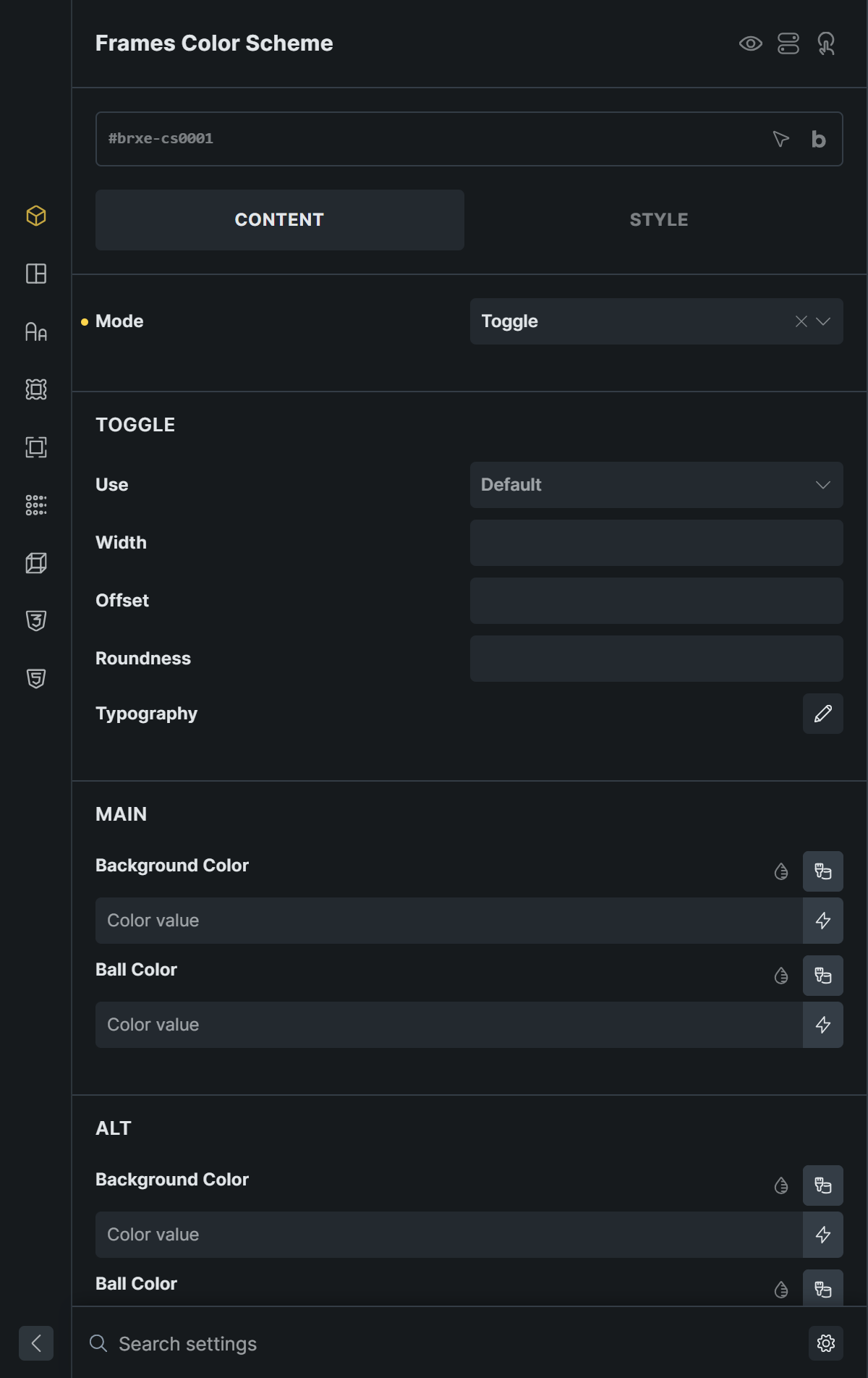
- Use chooses what the switch shows. Icons shows an icon for each scheme. Text Labels shows a word on each side of the switch.
- Icons Placement (with Icons) puts the icons Inside the switch or Outside on both sides.
- Width sets the width of the switch. The height is half of the width. Offset sets the space between the ball and the edge of the switch. It also sets the space between the switch and icons or labels placed outside of it. Roundness sets how round the corners of the switch are.
- Typography styles the text labels.
Main and Alt
The Main group styles the first state, which is the main color scheme of your site. The Alt group styles the second state, the alternative scheme.
- Main Icon and Alt Icon pick the icons. The defaults are a moon and a sun.
- Icon Color sets the color of the icon.
- Label (with Text Labels) sets the text, for example “Light” and “Dark”. Labels Color sets its color.
- Background Color and Ball Color set the colors of the switch and the ball in each state.

With text labels, clicking a word switches to that scheme, so visitors can click the word instead of the switch.
Mode: Simple
The Simple mode is a single button. Its icon changes from a moon to a sun, or the other way around, with a short morphing animation.

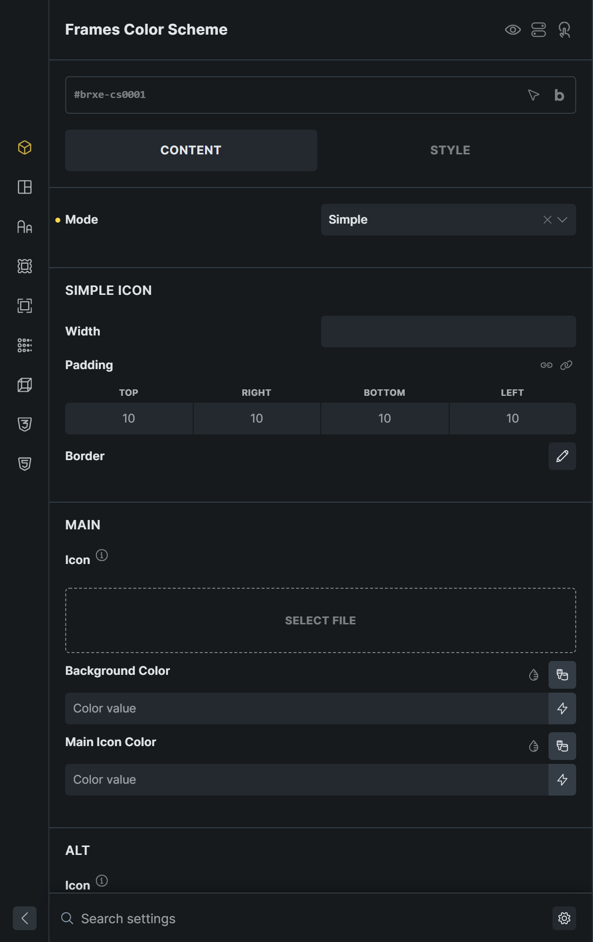
- Width, Padding, and Border style the button.
- Main and Alt each have an Icon, a Background Color, and an Icon Color. Use Select File to choose your own icons. Only SVG files are supported, and the shape of the icon is taken from the first
pathin the file, so use a single-path SVG.
Accessibility
Accessible Description is the name that screen readers announce for the toggle. The default is “Switch color scheme”. Write a name in the language of your page.
These keys work:
| Key | Action |
|---|---|
| Tab, Shift+Tab | Move to the switch (Toggle mode) or to the button (Simple mode). |
| Space | Flip the switch (Toggle mode). |
| Enter, Space | Press the button (Simple mode). |
In Toggle mode the switch is a real checkbox. In Simple mode it is a button with the same accessible name.
Tips
- Place the toggle in the header, where visitors expect it.
- Use the Text Labels style when visitors should see what they are choosing.
- Use only one toggle on a page.