
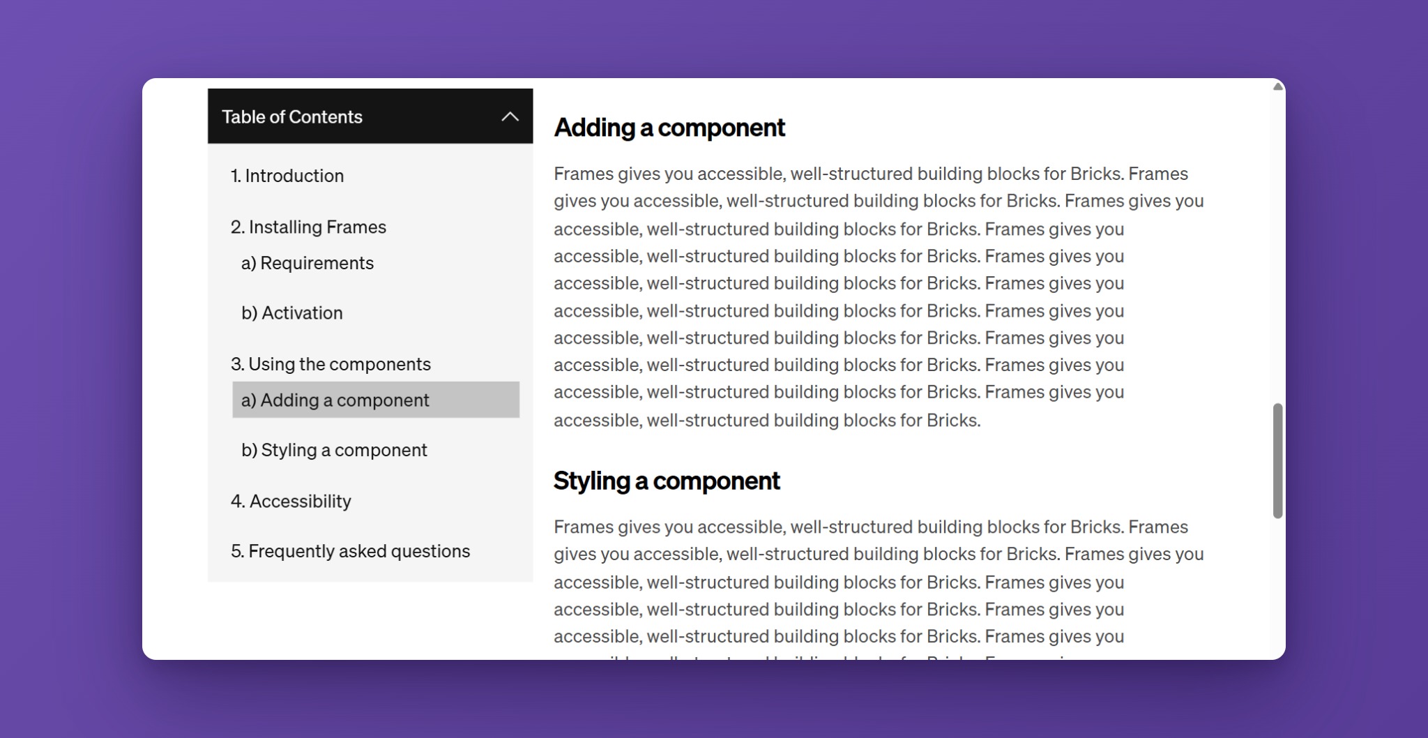
The Frames Table of Contents builds a navigation list from the headings on your page and keeps it in sync while your visitors scroll. It highlights the section that is currently in view, scrolls smoothly to a section when its link is clicked, and can collapse into an accordion to save space.
Use it on long articles, documentation, legal pages, or any page where visitors benefit from jumping between sections.
Activating the Table of Contents
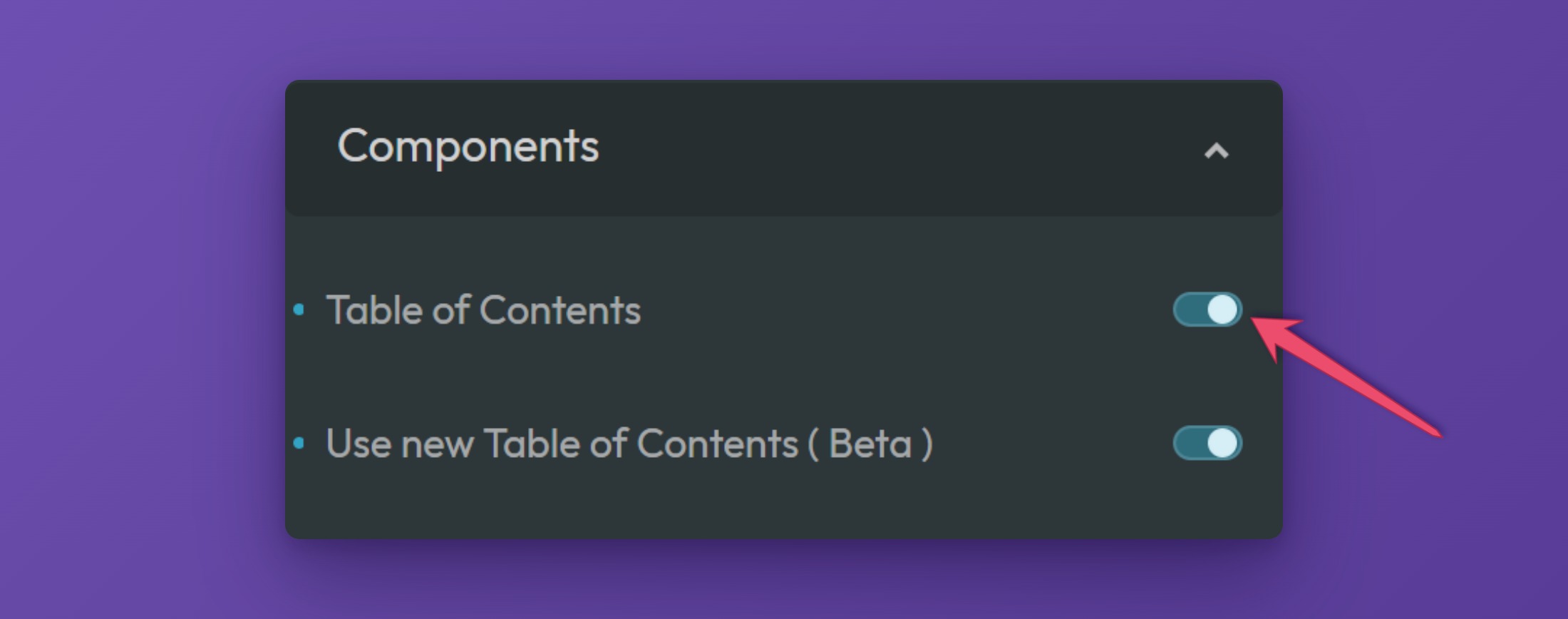
To use the Frames Table of Contents, make sure it is switched on in the ACSS dashboard. Open the dashboard in the builder, go to the Frames tab, and expand the Components panel.
There are two switches for this component:
- Table of Contents makes the element available in the builder.
- Use new Table of Contents (Beta) switches the element to the newer version. It adds the Header ID or Class Selector and Use Bottom Offset settings and shows a live preview of your list inside the builder.
Adding the Table of Contents to a Page (Bricks)
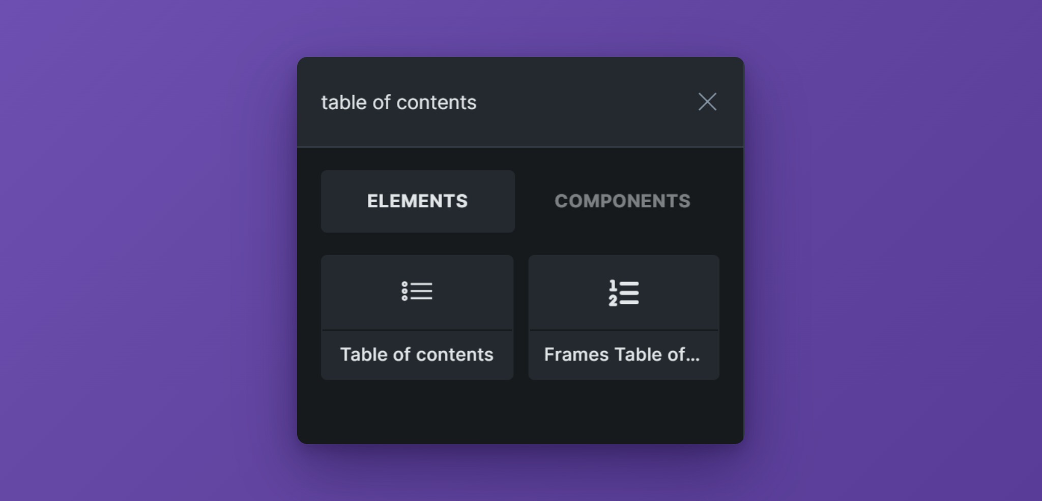
To add the Table of Contents, open the builder and click the plus sign to add a new element. Search for “Table of contents” and choose Frames Table of Contents from the Frames section.
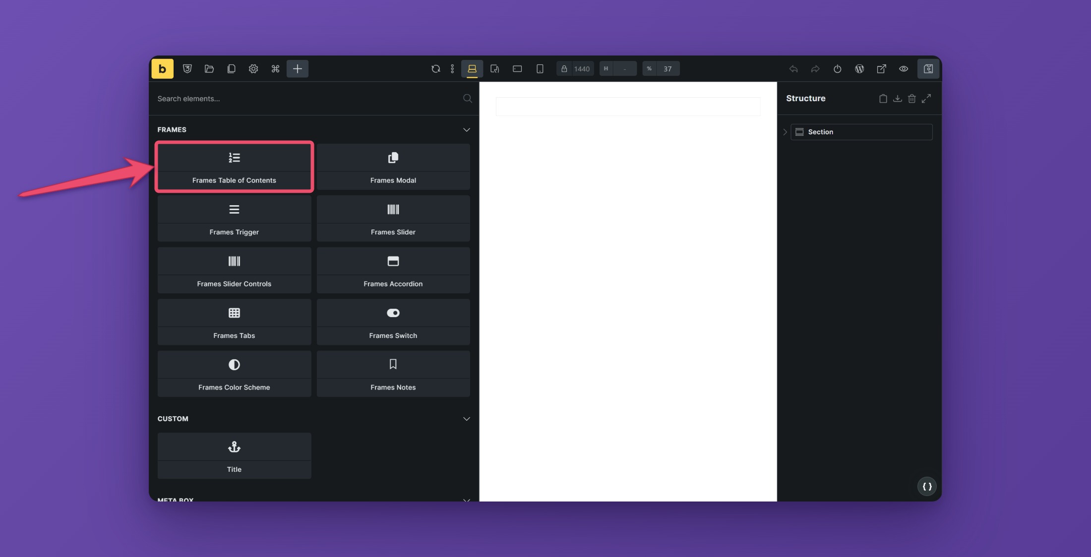
Bricks ships its own element that is also called “Table of contents”. Make sure you pick the one from Frames.
You can place the element anywhere on the page. It does not have to sit inside the content it lists. A common setup is a sidebar column next to the article, or a block above the content.
Choosing the Content to Scan
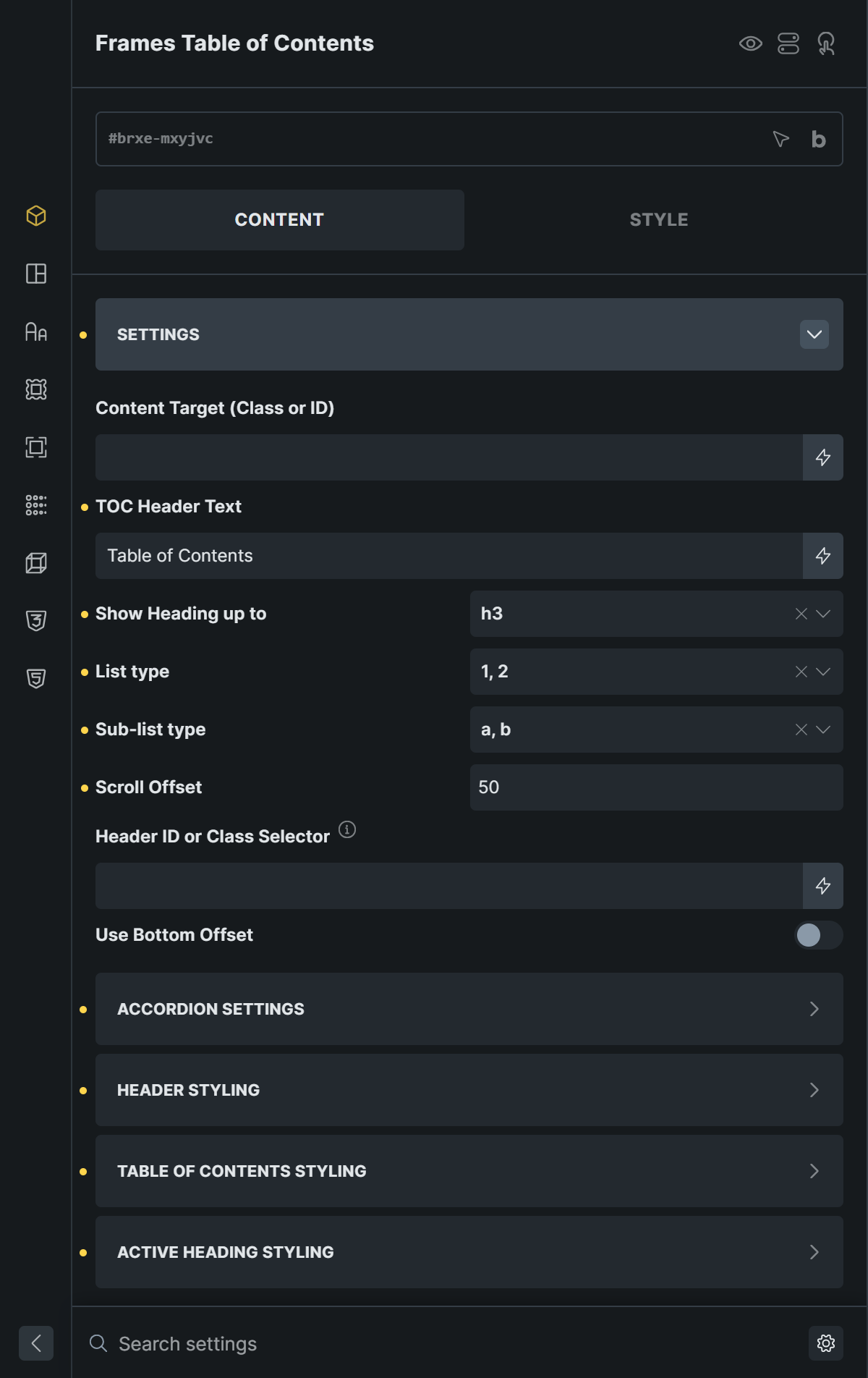
Open the Settings panel of the element. In Content Target (Class or ID), enter the selector of the element that contains your headings, including the leading dot or hash, for example .article-content or #post-content.
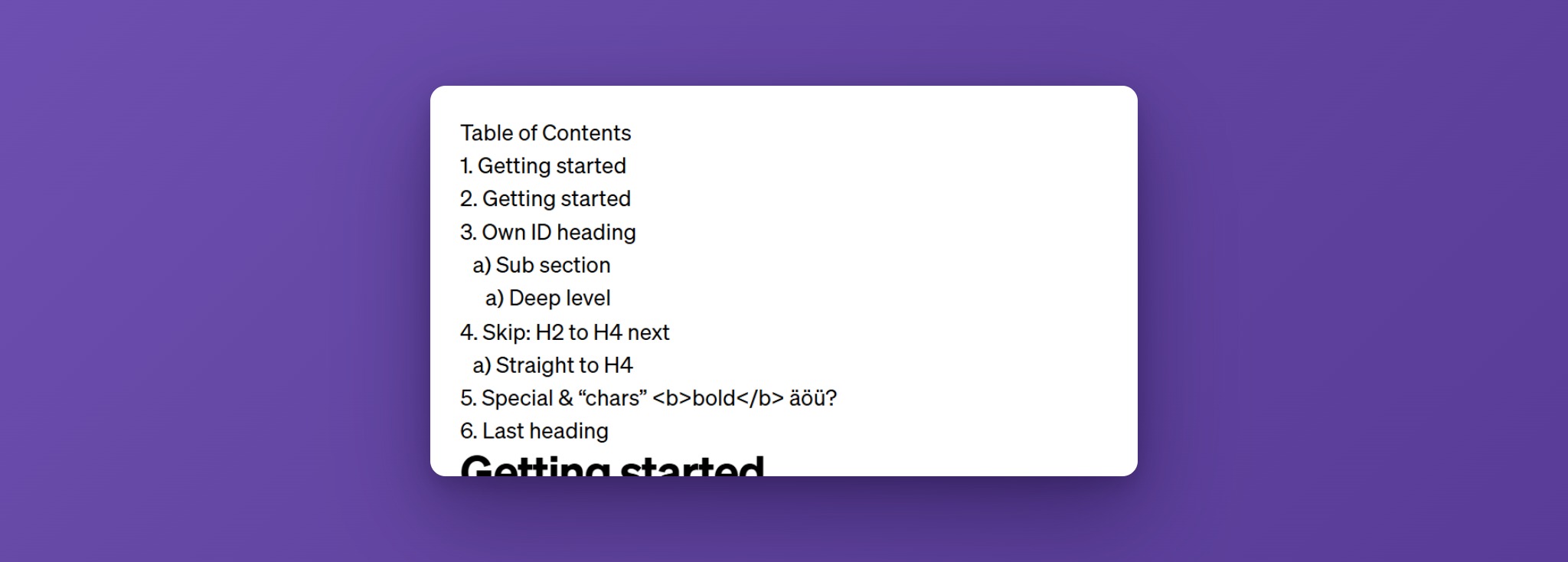
The Table of Contents reads every h2 to h6 inside that element and ignores everything outside of it. An h1 is never listed. Give the content element a class or ID in the builder first, then use it here.
Until a selector is set, the element shows a short placeholder notice instead of the list.
Headings that already have an ID keep it, so existing anchor links stay stable. Headings without one get an ID generated from their first words.
Choosing Which Headings to Show
Show Heading up to controls how deep the list goes. With the default h3, your h2 headings become the main items and h3 headings are nested below them. Pick h4, h5, or h6 to include deeper levels. Headings below your chosen level are left out.
If a heading level is skipped in your content, for example an h2 followed directly by an h4, the entry is simply nested one level down.
Header Text
TOC Header Text is the title shown above the list. It is also used as the accessible name of the navigation landmark, so screen reader users hear it as well. Rename it to match your page, for example “On this page”.
Numbering and List Style
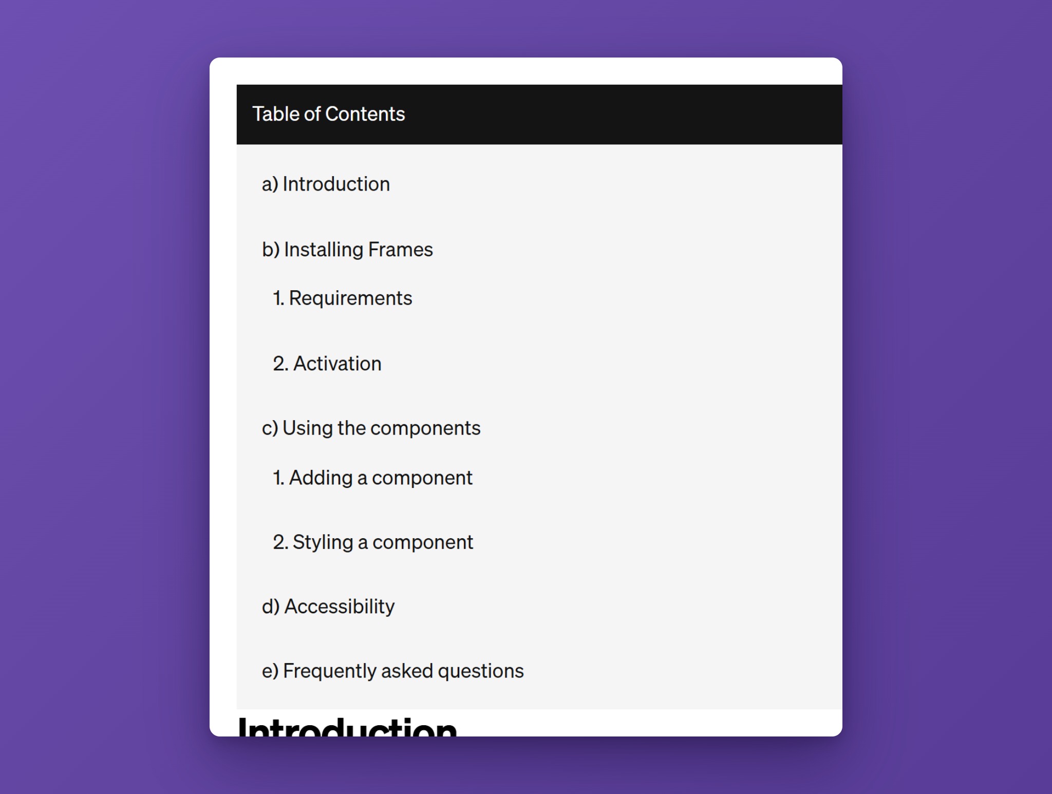
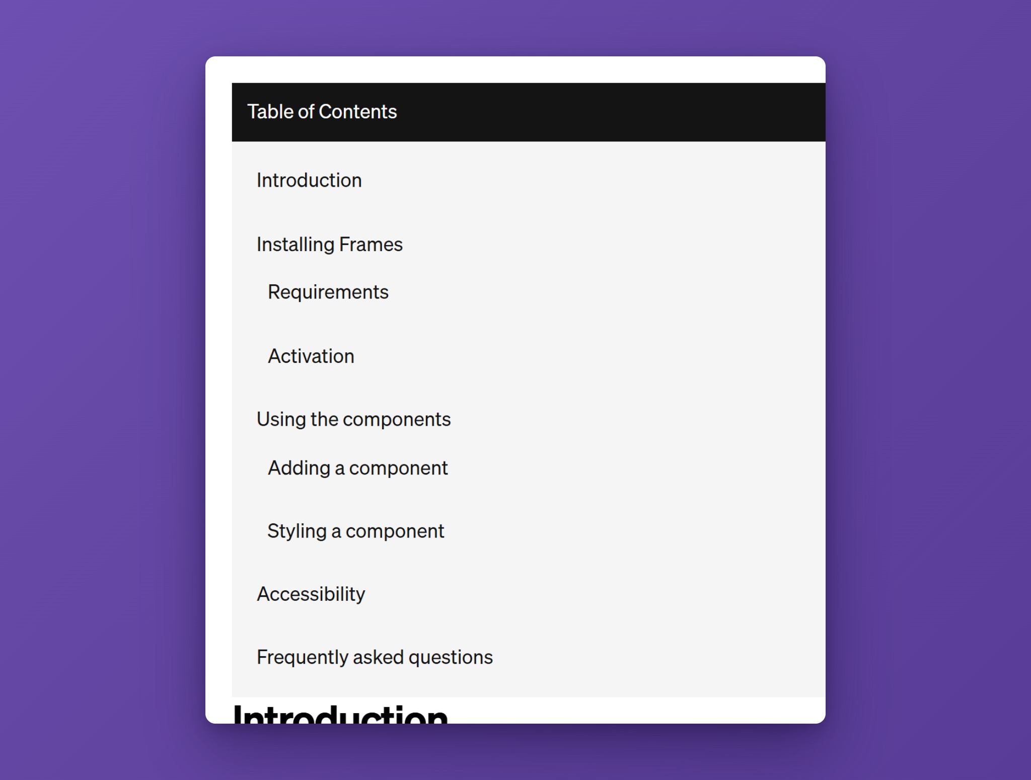
List type sets the numbering of the top level and Sub-list type sets it for every nested level below. Choose between numbers (1, 2), letters (a, b), or None.
The numbers are generated with CSS counters, so they restart inside every nested list and never end up in your heading text.
Using the Accordion
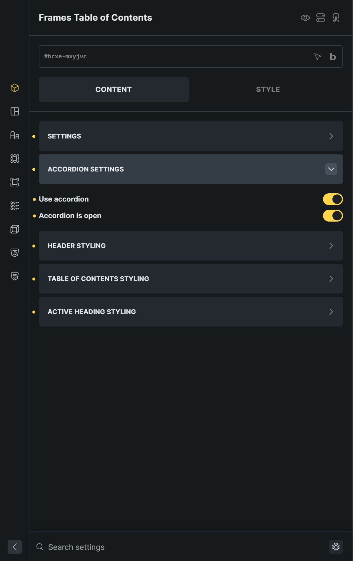
Open Accordion Settings to turn the list into a collapsible accordion.
- Use accordion turns the header into a button that expands and collapses the list. The arrow icon rotates to show the state. Turn it off for a static header.
- Accordion is open decides whether the list starts expanded or collapsed.

The accordion header is a real button with aria-expanded, and the links in a collapsed list are hidden from keyboard and screen reader users.
Scroll Offset and Fixed Headers
Scroll Offset is the space, in pixels, that the Table of Contents keeps above a heading after a visitor clicks its link. The same value decides when a section counts as the active one while scrolling.
If your site has a fixed or sticky header, enter its selector in Header ID or Class Selector (new Table of Contents only), for example #brx-header or .site-header. The selector must start with # or .. The Table of Contents measures the header and adds its height to the offset, so headings are never hidden underneath it.
Without a header selector, the Table of Contents adds an allowance of 100px on top of your Scroll Offset. If the WordPress admin bar is showing, its 32px are added as well.
Visitors who prefer reduced motion get an instant jump instead of smooth scrolling.
Use Bottom Offset
The last section of a page is often too short to scroll up to the active position, so its link never gets highlighted. Turn on Use Bottom Offset (new Table of Contents only) and the Table of Contents adds the missing space after your content so the last heading can reach the top as well. It only adds space when it is actually needed.
Highlighting the Active Heading
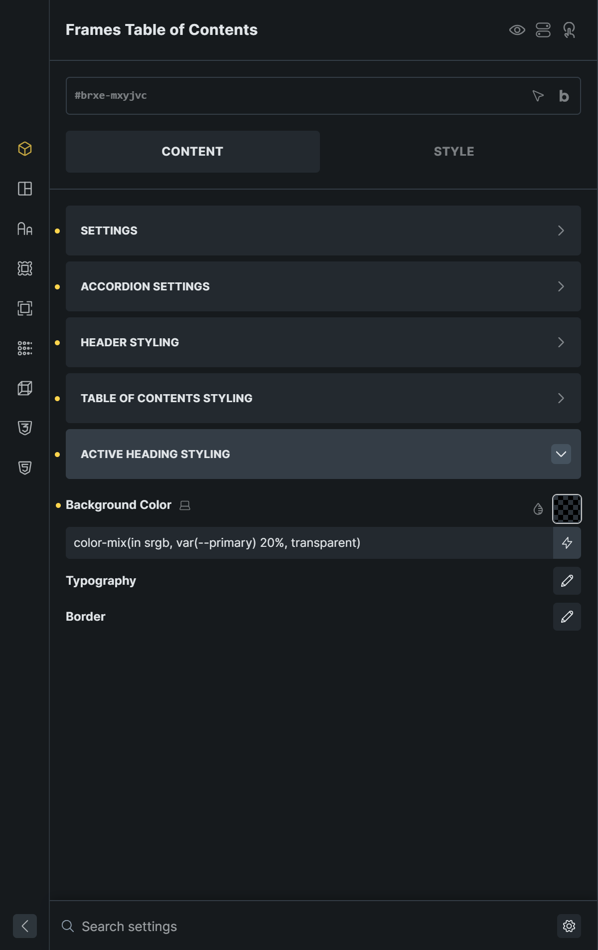
While your visitors scroll, the link of the section in view receives the class fr-toc__list-link--active. Style it in the Active Heading Styling panel using the background color and typography controls.
A sticky Table of Contents works best for this. Select the element, open the Style tab, then Layout, and set the position to Sticky with a top value.
Styling the Table of Contents
The Table of Contents is styled from three panels on the Content tab. The defaults use your ACSS variables, so the component follows your palette and spacing out of the box.
Header Styling controls the title bar: background color, text color, typography, border, padding, the arrow icon, and the icon’s color, background color, size, background size, and border.
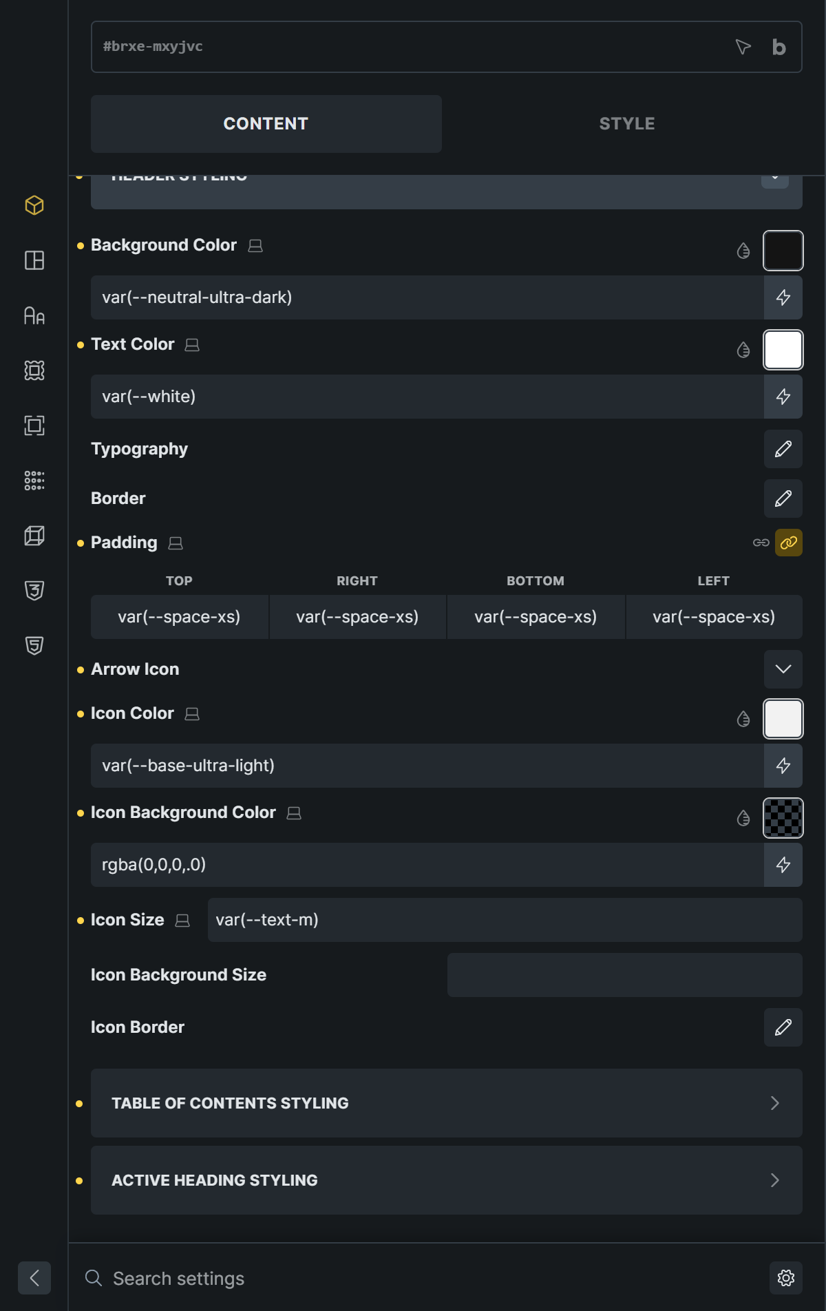
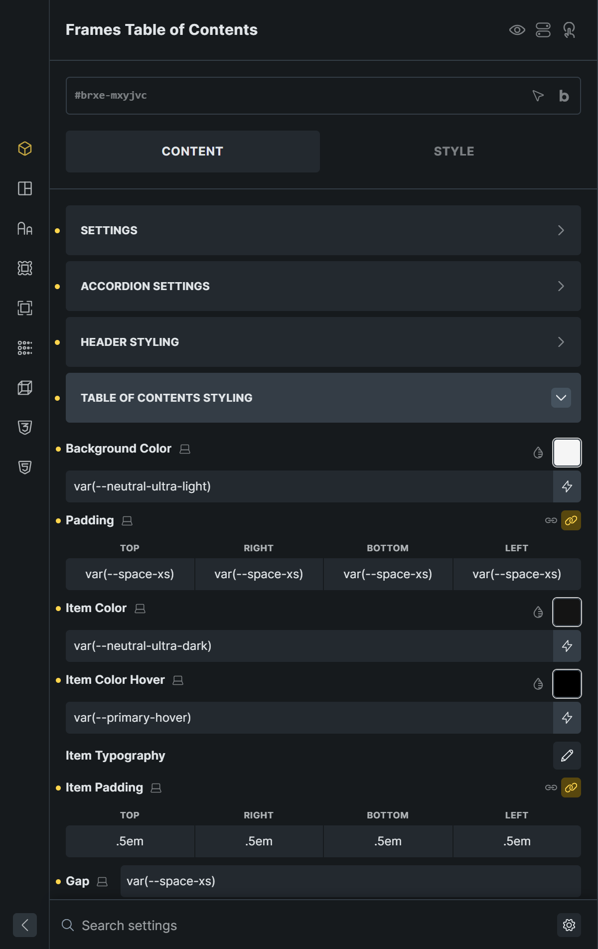
Table of Contents Styling controls the list area: background color, padding, item color, item hover color, item typography, item padding, and the gap between items.
Active Heading Styling controls the highlighted link.
CSS Classes
For styling that goes beyond the panels, use these classes in your own CSS.
| Class | Element |
|---|---|
.fr-toc | The navigation wrapper |
.fr-toc__header | The header, a button when the accordion is on |
.fr-toc__heading | The header text |
.fr-toc__icon | The arrow icon wrapper |
.fr-toc__body | The collapsible body |
.fr-toc__list-wrapper | Wrapper around the list |
.fr-toc__list | Every list, top level and nested |
.fr-toc__list-item | A list item |
.fr-toc__list-link | A link in the list |
.fr-toc__list-link--active | The link of the section in view |
Good to Know
- Use one Table of Contents per page. The script sets up the first one it finds.
- The list is built when the page loads, so it works with static and dynamic content, including post content.
- If the selector in Content Target does not match an element on the page, the Table of Contents stays empty.