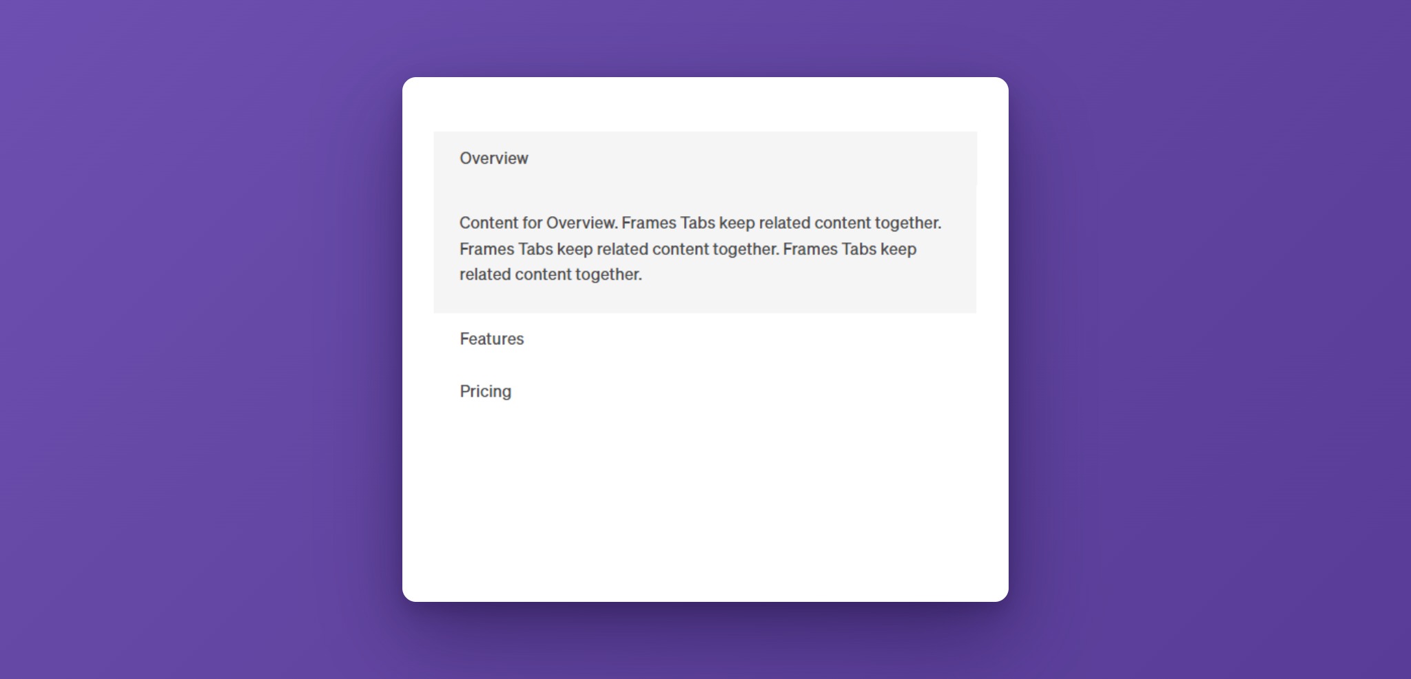
The Frames Tabs element groups related content under a row of tab links. Visitors click a tab to see its content, and only one panel is visible at a time. The active tab can slide smoothly from one tab to the next, and on small screens the tabs can turn into an accordion.
Use it for product features, pricing options, code examples, or any content that is easier to read in short, separate pieces.
Activating Tabs
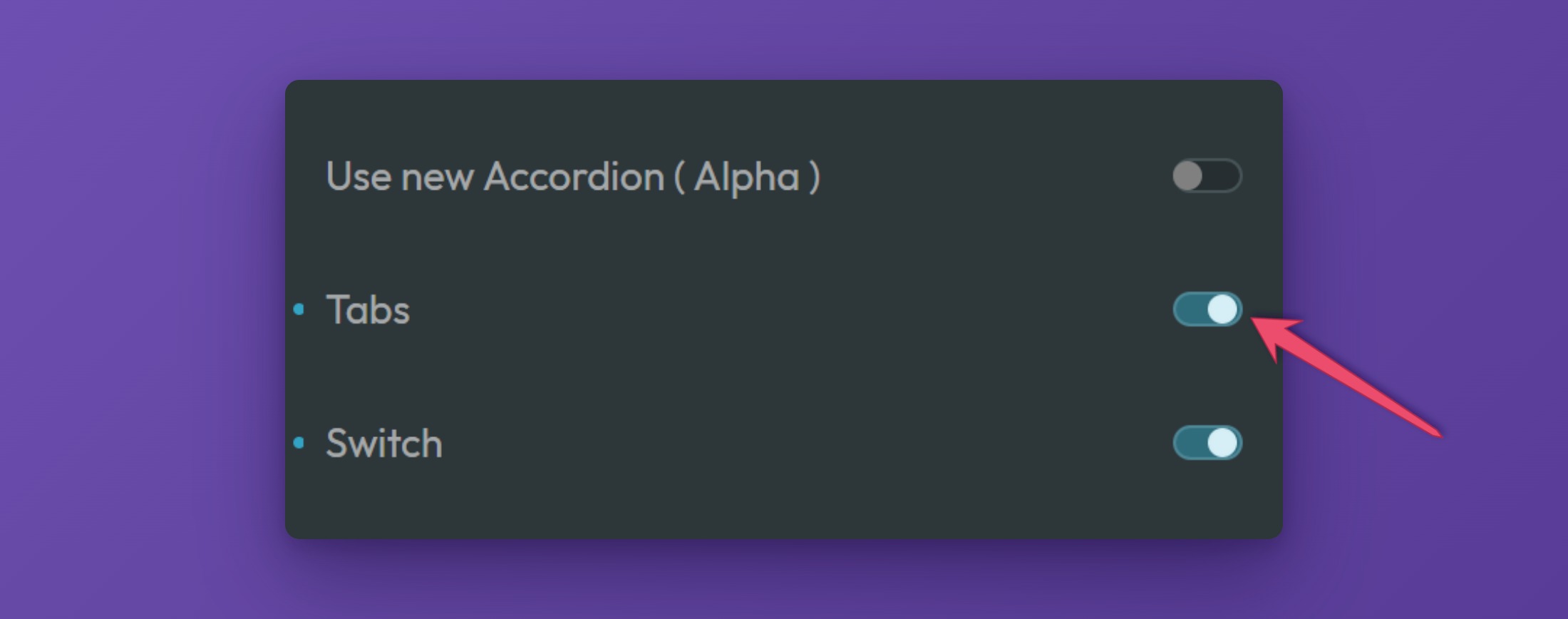
To use the Frames Tabs, make sure they are switched on in the ACSS dashboard. Open the dashboard in the builder, go to the Frames tab, and expand the Components panel. Switch on Tabs.
Adding Tabs to a Page (Bricks)
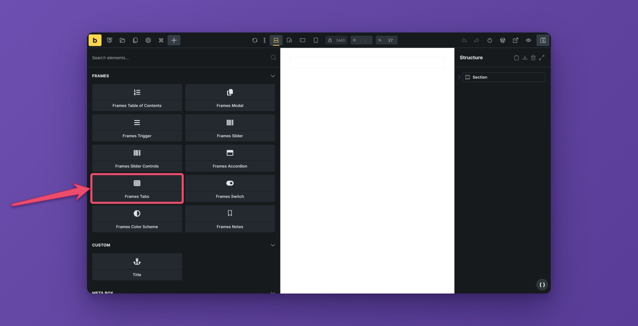
Open the builder, click the plus sign to add a new element, search for “Tabs”, and choose Frames Tabs from the Frames section. Bricks ships its own Tabs element too, so pick the one from Frames.
The new element comes with three tabs and three content panels already in place.

Structure
The element has two parts, the navigation and the content:
- Tabs Navigation holds the Navigation List. Each Navigation Item in it is one tab link, with the tab title inside.
- Tabs Content Wrapper holds one Tabs Item Wrapper for each tab. Inside it, Tabs Item is the content area that you fill with text, images, buttons, or any other element.
The first Navigation Item belongs to the first Tabs Item Wrapper, the second to the second, and so on. To add a tab, duplicate a Navigation Item and duplicate a Tabs Item Wrapper, and keep both in the same order.
The navigation is a list (ul) and each tab is a list item (li).
Settings
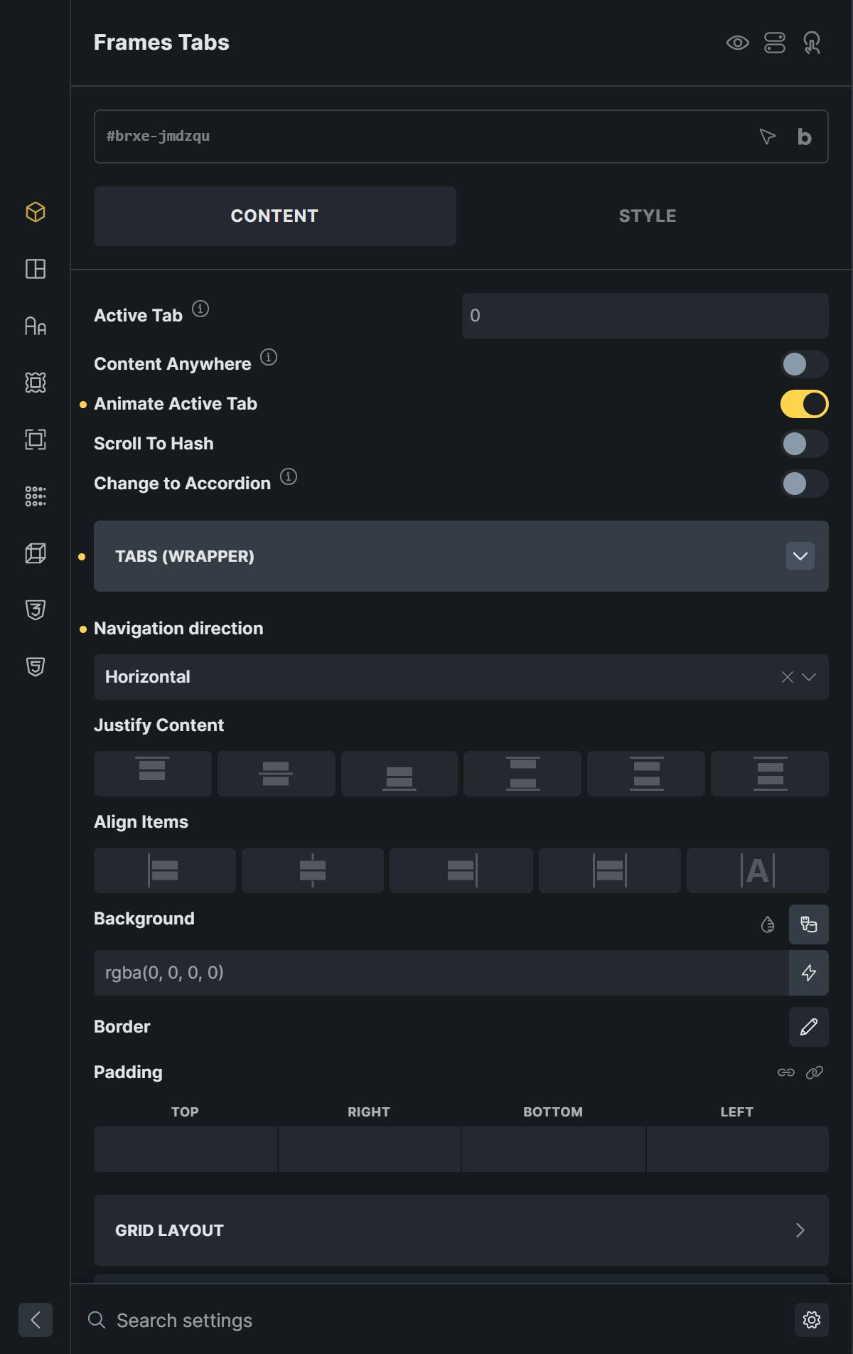
Open the Content tab of the element to find the main settings.
Active Tab
Active Tab sets which tab is open when the page loads. The first tab is 0, the second is 1, and so on.
Animate Active Tab
With Animate Active Tab on (the default), a background slides from the old tab to the new one when a visitor switches tabs. Switch it off for an instant change. The slide uses the Slide Duration and the Background of the active tab (see Styling).

Scroll To Hash
With Scroll To Hash on, every tab gets its own web address. Clicking a tab adds a hash such as #tab-pricing to the address in the browser. Visitors can copy that link, and opening it shows the right tab. The Back button of the browser returns to the previous tab.
For this to work, give each Navigation Item an ID in Bricks, for example tab-pricing. The hash is that ID. Scroll Offset sets how many pixels of space stay above the tabs when the page scrolls to them, for example the height of a fixed header.
Change to Accordion
Turn on Change to Accordion to show the tabs as an accordion on small screens, which usually works better than a long row of tab links on a phone.
- Change to Accordion on is the screen width up to which the accordion is shown.
- Close Previous Accordion closes the open panel when another one is opened, so only one is open at a time.
- Slide Duration is the time in milliseconds the panels take to open and close.
- Header Background Color and Header Color style the accordion headers.
Content Anywhere
By default the panels sit directly below the tab links. With Content Anywhere on you can show them somewhere else on the page, for example in a different column.
- Switch on Content Anywhere.
- In the structure panel, drag the Tabs Content Wrapper out of the Tabs element to the place where the content should appear.
- Give that wrapper a unique class, for example
my-tabs-content. - Enter the class with a leading dot, for example
.my-tabs-content, in Content Outside Selector.
Use a single class or ID as the selector. Selectors that contain spaces, such as .my-tabs .out, do not work.
Styling
Tabs (Wrapper)
The wrapper controls the whole navigation bar.
- Navigation direction switches between horizontal tabs and a vertical list of tabs.
- Justify Content and Align Items align the tab links inside the bar.
- Background, Border, and Padding style the bar itself.

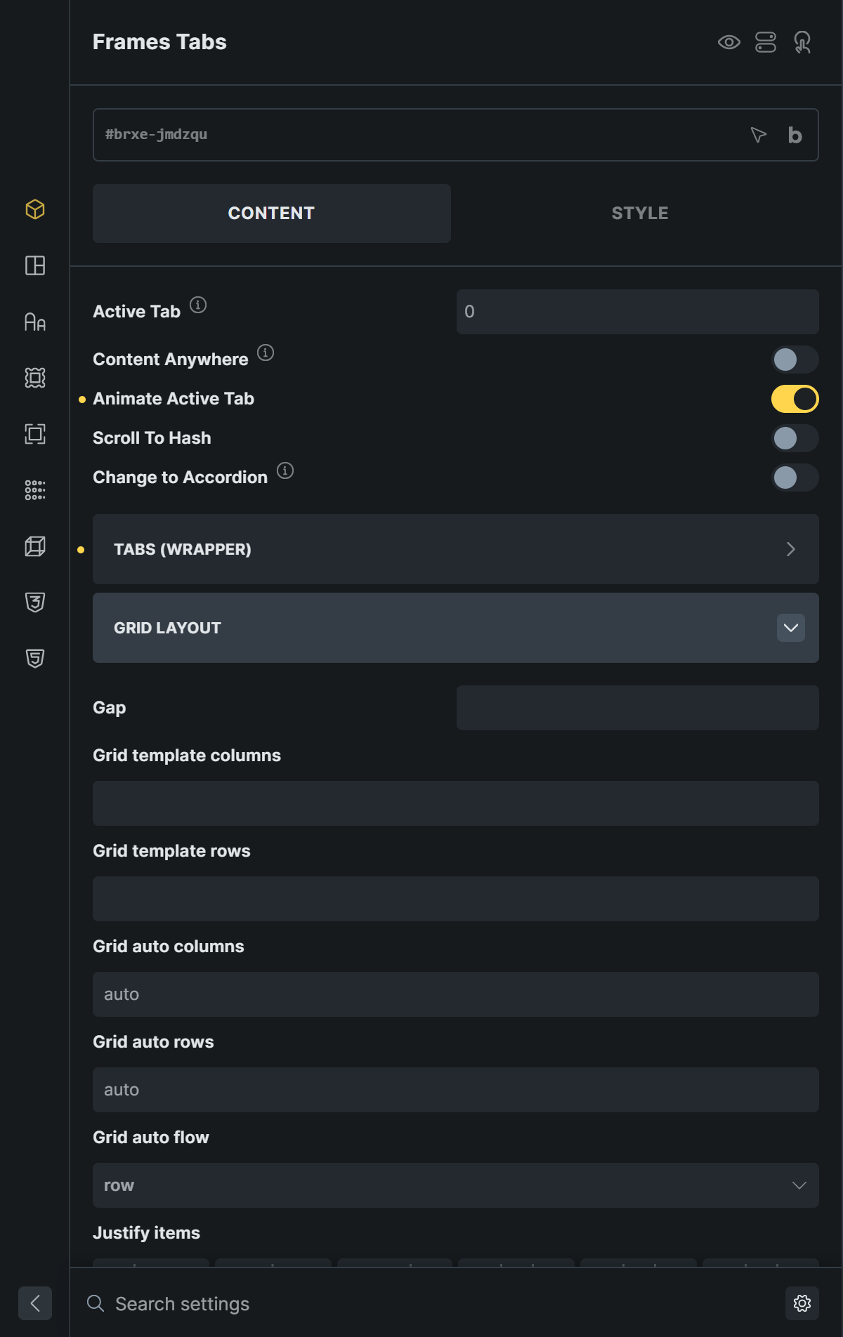
To place the navigation next to the content, for example in a vertical layout, use the Grid Layout group of the element. It has the usual grid controls: gap, columns, rows, and alignment.
Tabs (Item)
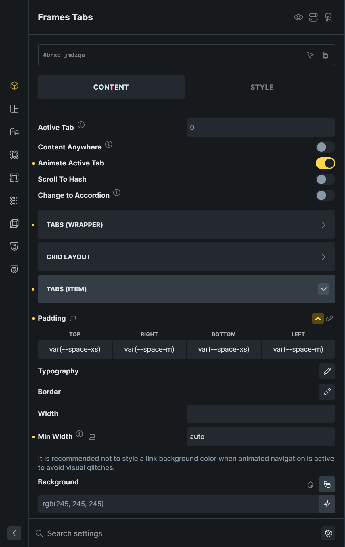
- Padding, Typography, Border, Width, and Min Width style each tab link. A minimum width is useful for mobile navigation.
- Background colors the tab links. When Animate Active Tab is on, set the background of the whole bar with Navigation List Background instead, so the sliding highlight is not covered by the individual tab backgrounds.
Tabs (Item Active)
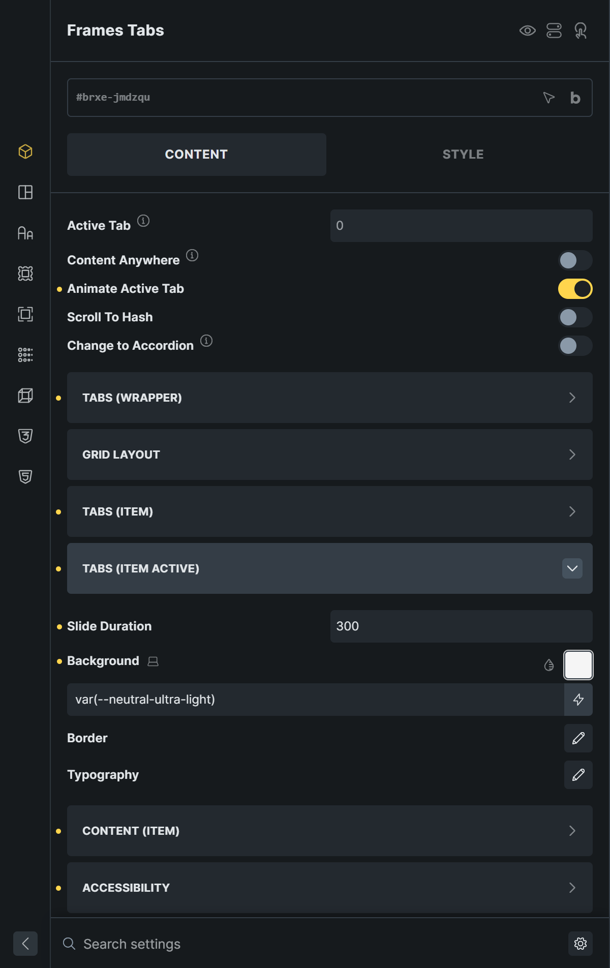
Slide Duration, Background, Border, and Typography style the active tab. The background is also the sliding highlight.
Content (Item)
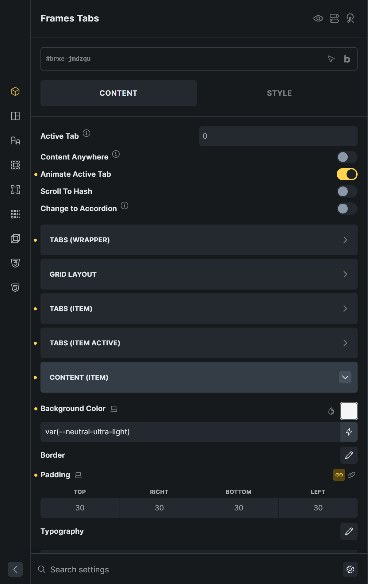
Background Color, Border, Padding, and Typography style the content panel.
Accessibility
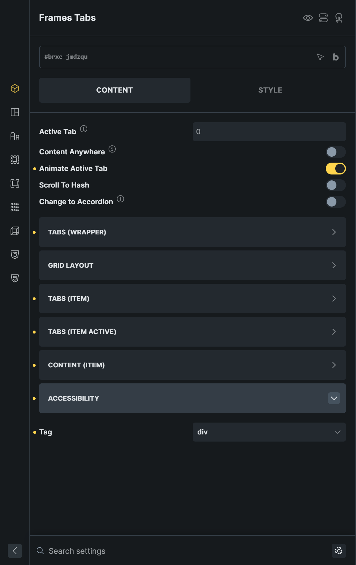
Tag sets the HTML tag of the Tabs element: div (default), section, aside, or header.
Accessibility and Keyboard
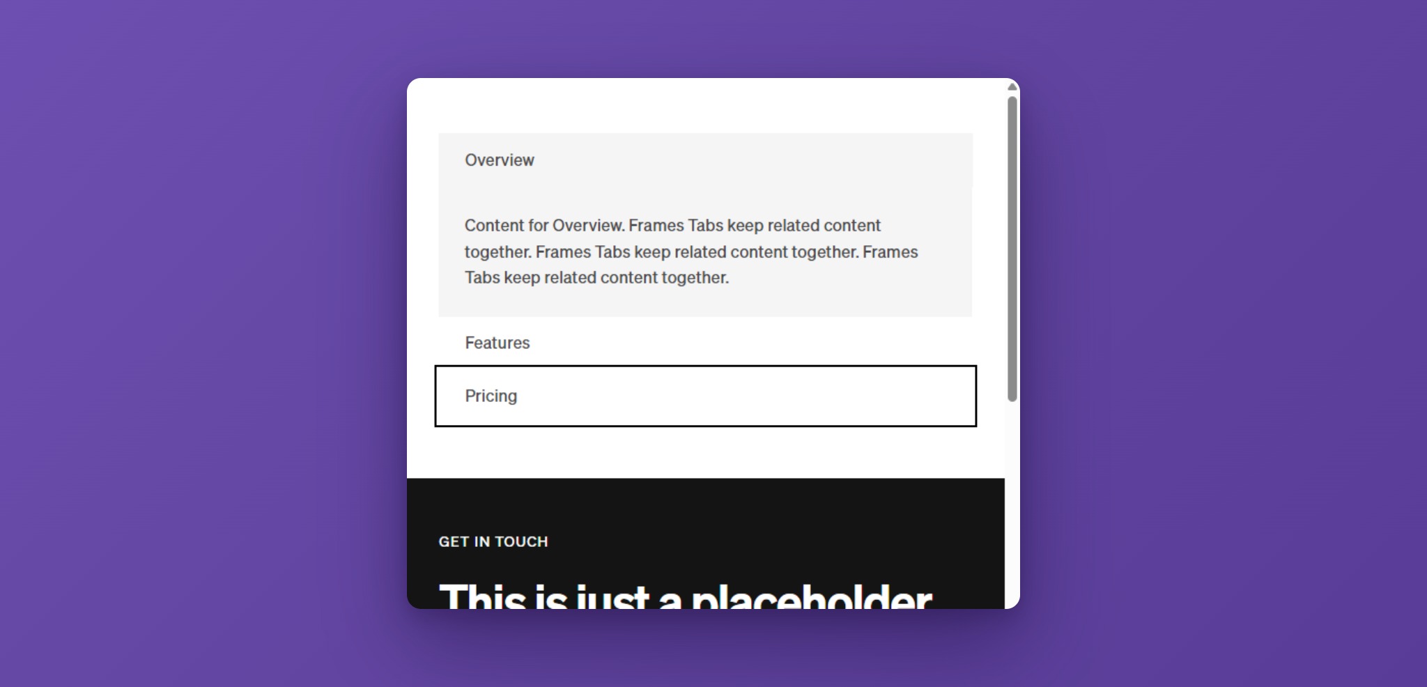
The Tabs follow the ARIA Authoring Practices Guide for tabs. Only the active tab is in the Tab key order, so a visitor reaches the tab list with one press of Tab and the content with the next.
| Key | Action |
|---|---|
| Tab, Shift+Tab | Move into the tab list (onto the active tab), then on into the content of the active tab. |
| Right Arrow, Left Arrow | Horizontal tabs: go to the next or previous tab and show its content. After the last tab, Right Arrow goes back to the first. |
| Down Arrow, Up Arrow | The same for vertical tabs. |
| Enter | In accordion mode on small screens: open or close the focused item. |
The tab links form a tab list. The active tab is announced as selected, and each tab is linked to its panel. The slide animation is switched off for visitors who have reduced motion turned on in their system.
Tips
- Keep the tab titles short. A long row of tabs does not fit on a phone, so use Change to Accordion when you have more than three or four tabs.
- If you use two Tabs elements on one page, they work independently.
- Keep the navigation items and the content wrappers in the same order. The first tab always opens the first panel.