The Trigger component was designed primarily as a trigger for mobile menus and off-canvas elements, but it can be used to trigger the Modal component or anything else that can be triggered via a class reference.
Activating the Trigger component
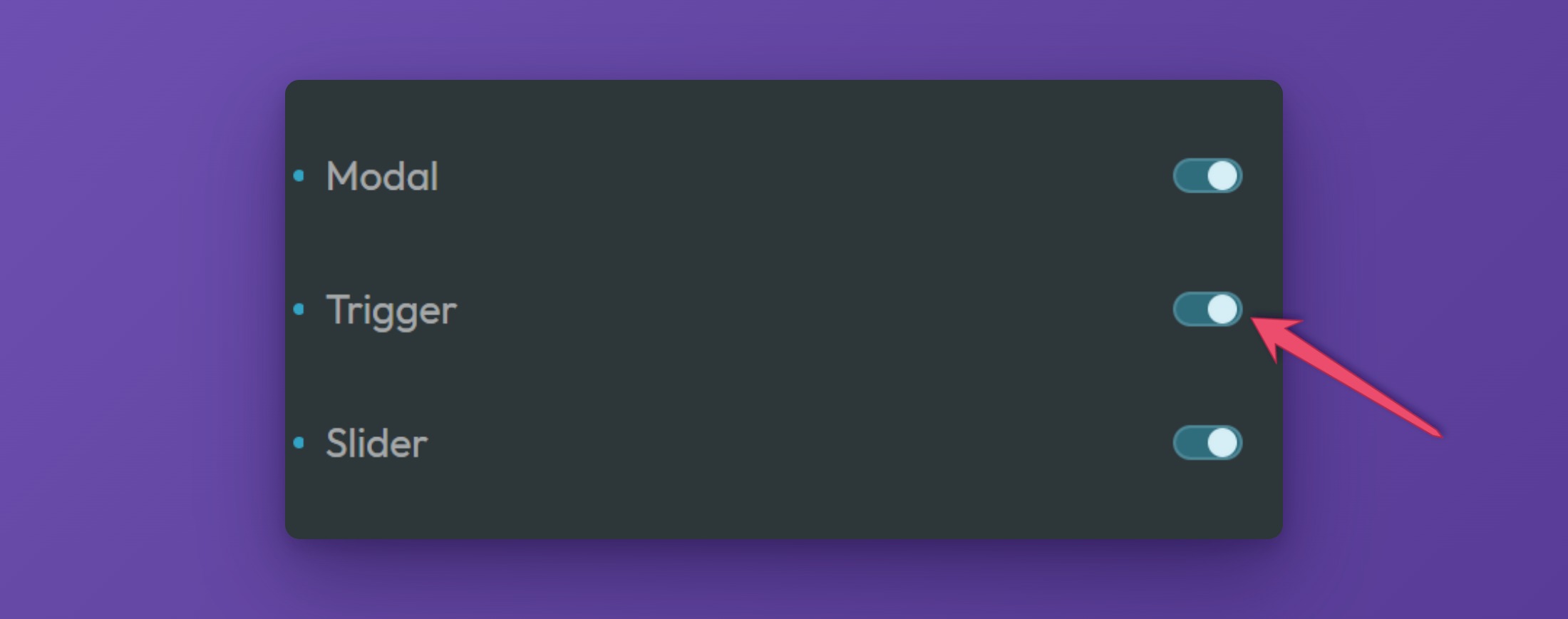
To use the Frames Trigger, turn it on in the ACSS dashboard. Open the dashboard in the builder, go to the Frames tab, expand the Components panel, and switch on Trigger:
Once the component is activated, a block for adding it will become available inside the builder.
Adding the Trigger to a page
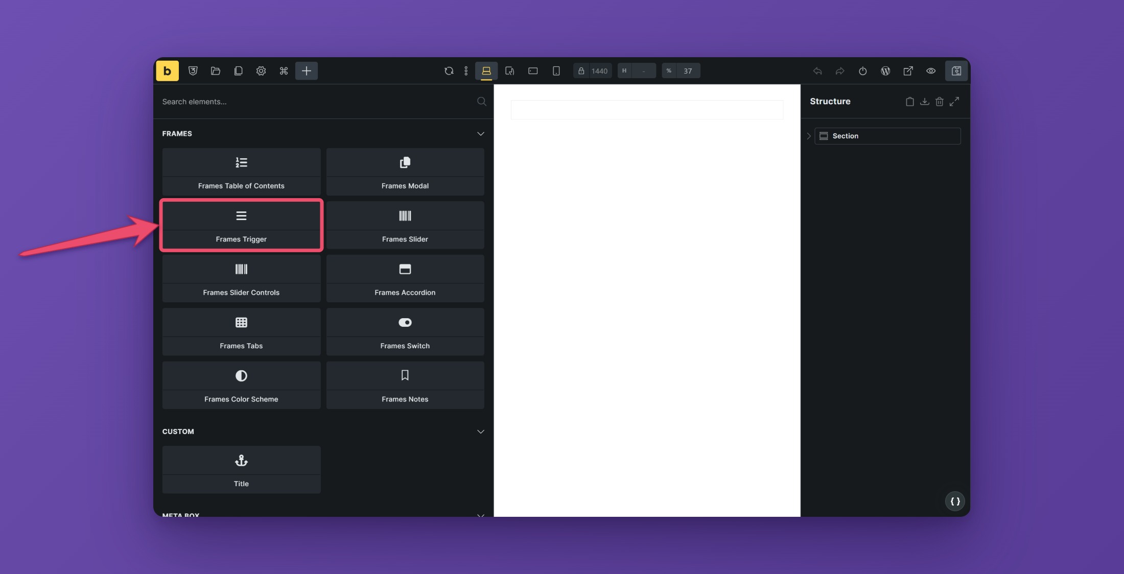
To add the Trigger to a page, open the element panel and choose Frames Trigger from the Frames section. You can place the trigger anywhere you’d like on the page.
Setting the animation style
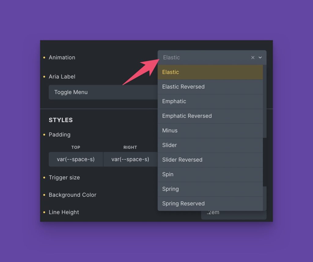
The Trigger component animates between a traditional burger icon and a close icon. You can choose the style of animation from the Animation dropdown:
Basic Trigger styling
To style the Trigger, open the “Styles” panel:
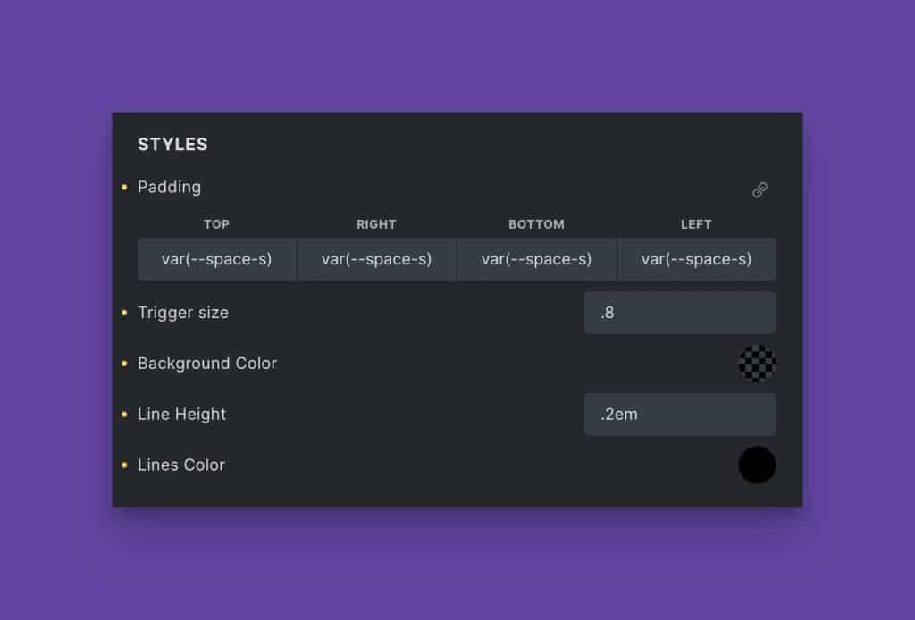
You can control the trigger padding, trigger size, background color, line height, and line color from this panel. It should all be relatively straightforward.
Adding a text label
You can add an optional text label by activating the “Add Text” switch.
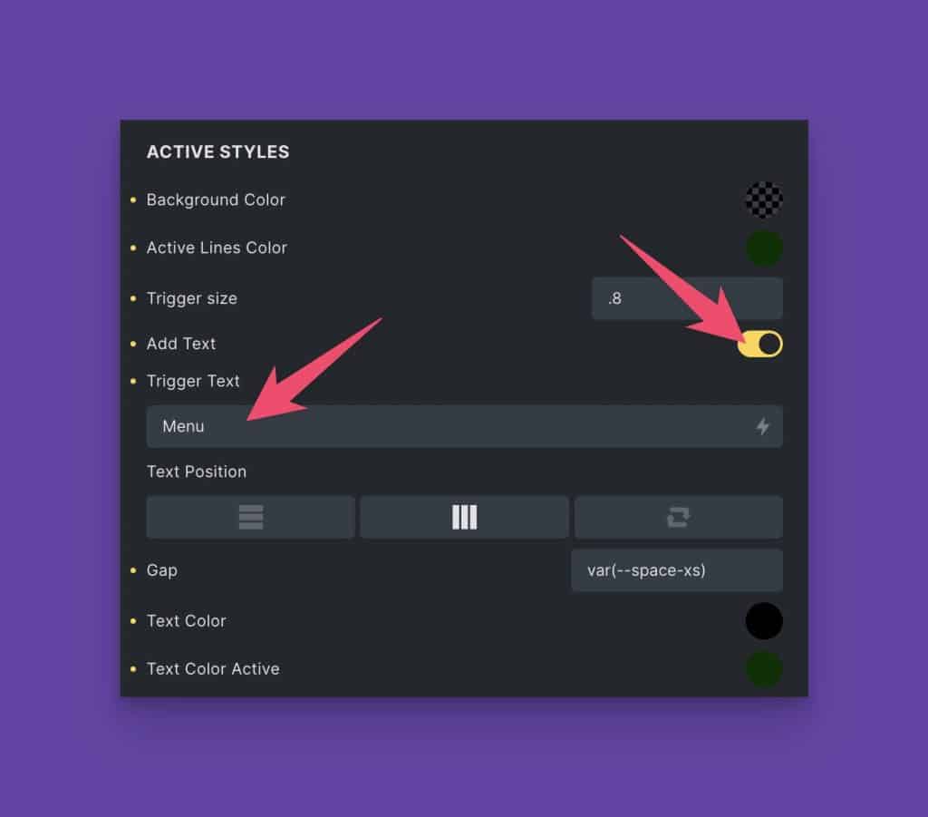
Once you activate this switch you’ll see additional options. You can set the text for the label in the “Trigger Text” input. You can also edit the text position, gap between the text and the Trigger, text color, and active text color.
Styling the active Trigger state
You can style the active state of the Trigger separately using the “Active Styles” panel:
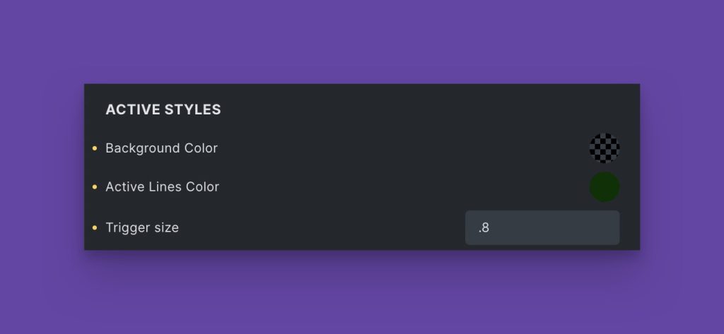
You can change the background color, line color, and trigger size for the active state.
Linking the Trigger to a triggerable element
The Trigger is designed for use with a triggerable element that listens for a click on an element with a specific class. For example, our Modal.
Place the trigger class on the Trigger component and ensure the triggerable element is configured to listen for that class.