Frames is loosely based on Atomic Design principles. This makes the library more modular and flexible than most other design sets.
Instead of being organized by category alone, Frames is also organized by type.
Example Categories
Categories are used to describe the original purpose of a Frame.
- Features
- Profile
- Content
- Contact
- Bog
- Image Groups
- Heroes
- CTA
- Social Proof
These are just examples and there are many more.
Example Types
Types are used to describe the frame within the context of atomic design.
- Template
- Section
- Grid
- Single
Starting from the bottom:
A single Frame is akin to an atom or molecule in Atomic Design. It’s an individual element or small group of elements that can be placed or used anywhere.
A grid Frame is more akin to a larger molecule, but within the context of grouping and laying out single Frames. They’re named after their use of CSS Grid.
A section is akin to an organism in Atomic Design and comes with a semantic section tag along with default inline and block padding.
A template is a full page or template part.
Anatomy of an example Frame
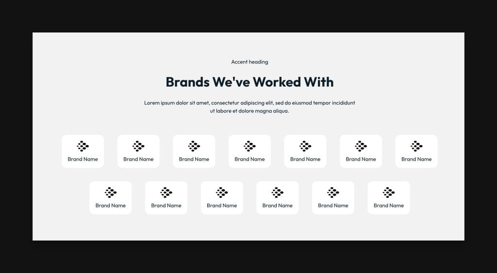
The above Frame is Logo Section Charlie, but it comprises multiple Frames.
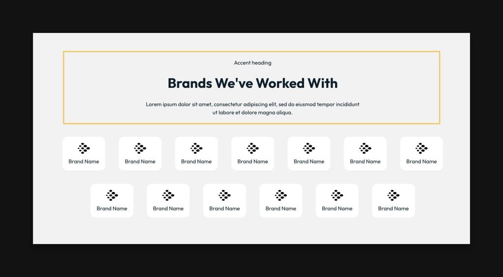
First from the top is Intro Alpha, an introduction frame used in many other frames to introduce section content.
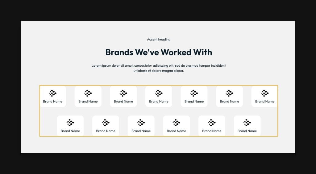
Next is Logo Grid Charlie, the actual grid of logos.
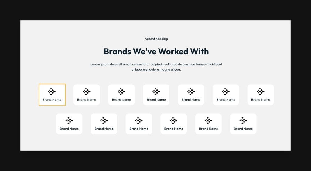
Last is Logo Charlie, a single “atom/molecule” Frame that can be used anywhere on the site, but happens to be used 13 times in this particular Grid and Section.
Why do some Frames share the same name while others don’t?
Continuing with the example above, the Section, Grid, and Single Frames all share the same name (Charlie). The Intro Frame used in this section has a different name (Alpha).
The Section, Grid, and Single Frames were all created within the same context simultaneously, so they all get the same name to denote their original context. However, this doesn’t mean you must always use them together. Any Frame can be used inside any other Frame with the exception of putting a Section Frame inside another Section Frame or a Grid Frame inside another Grid Frame (since these are true parent Frames).
Let’s say you wanted to add a grid of testimonials below Logo Grid Charlie in the above section. You can open the library, navigate to grids, filter by social proof, and then choose any testimonial grids you like. Their name doesn’t matter.
For example, you could insert Testimonial Grid Lima into Logo Section Charlie. Now you’re mixing and matching Frames to create your own unique layouts and flow.
Notice momentarily that there’s a Testimonial Section Lima Frame that uses Testimonial Grid Lima. If Frames weren’t modular, you’d have to insert Testimonial Section Lima below Logo Section Charlie, drag Testimonial Grid Lima out of it and into Logo Section Charlie, and then delete the rest of Testimonial Section Lima that you don’t intend to use.
That’s a messy and inefficient workflow! Since Frames is modular and provides you with all Frame types independently, you just insert Testimonial Grid Lima into Logo Section Charlie and move on with your life.
Additionally, if you don’t like that we used Intro Alpha in this section, you could swap it for a different Intro Frame.
This is precisely how Frames was designed to work. It gives you maximum flexibility with your layouts.
When to use a Section vs a Grid
Pages should be laid out in Sections. The section tag is a semantic HTML tag that denotes the start of a new topic. So, start by adding Section Frames when you’re beginning a fresh page layout and make sure you don’t try to put any Section Frames inside any other Section Frames.
Grid Frames exist within a section, and it’s okay to use more than one grid in a section as long as you aren’t changing topics or contexts with the content they contain.
For example, don’t put a blog post grid below a testimonial grid in the same section. Even though it may “look good” to you, it doesn’t make sense semantically.
What about Section Frames with inner containers that aren’t other Frames?
Some Frames aren’t made up of other Frames. For example, Hero Section Quebec:
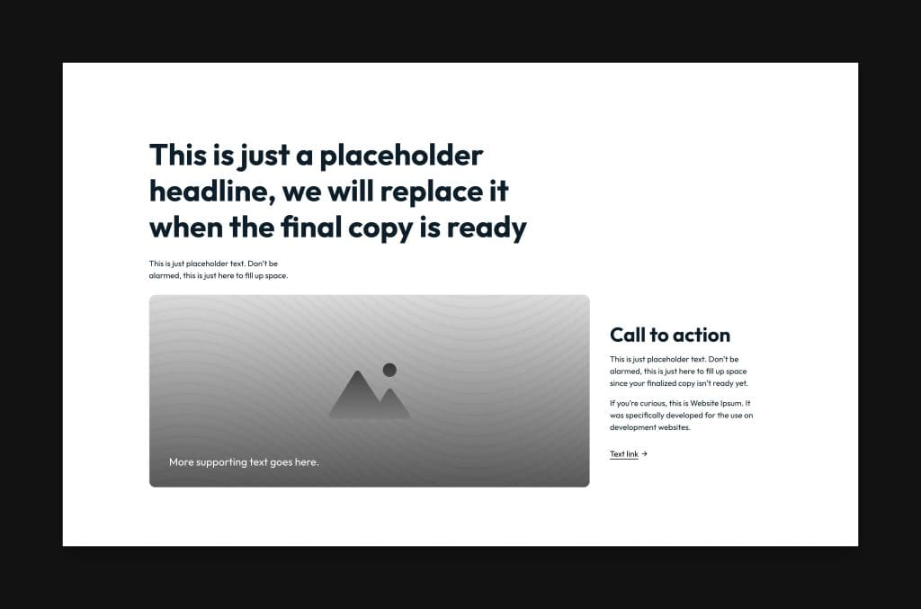
This Frame has two inner containers, one for the header/intro and one for the CTA layout. These are called Inner Top and Inner Bottom, respectively.
These inner containers are not Frames because they’re not designed to be used elsewhere. They’re designed specifically to be used within Hero Section Quebec, thus their classes all share the .fr-hero-quebec prefix and aren’t listed anywhere in the library.
Adding Your Own Elements
Try to remember that Frames is just a starting point for your work. It’s not the be-all, end-all solution for creating pages and sites.
You can add a custom section, grid, or single component you build from the ground up anytime you’d like! Frames have no limitations because you aren’t forced to use them for everything.
Have fun and let us know if you have any questions!