
Whenever I bring a tool or product to market, I have one general rule: don’t create “just another” thing.
Automatic.css isn’t “just another” framework. My Inner Circle isn’t “just another” community. And Frames isn’t “just another” design set.
If I can’t innovate and bring fresh ideas to the table, I don’t sit at the table.
So, when people ask me, “What’s the difference between Frames and XYZ design set,” I have a lot to say. Why? Because there are a lot of essential differences. If these differences didn’t exist, Frames wouldn’t exist.
I’ll warn you upfront: this is a lengthy write-up with plenty of examples. And some of it is a little technical because the technical aspects of a product like this are crucial. After all, this impacts your work and your reputation as a freelancer/agency.
If you have pride in your work and care about your reputation, you need to know that you’re building with the best possible tools. Right?
So, I will take the time to explain the differences in detail.
Frames isn’t a design set – it’s an unopinionated “pre-design” tool
An essential rule in profitable web design is: don’t work backward. If you care at all about building custom or semi-custom websites, pre-styled design sets break that rule immediately.
Design sets require you to constantly un-style and re-style elements because they’re so opinionated. Every time you add a block, you have to take two steps backward before you can start moving forward with your buildout.
A competitor design set block
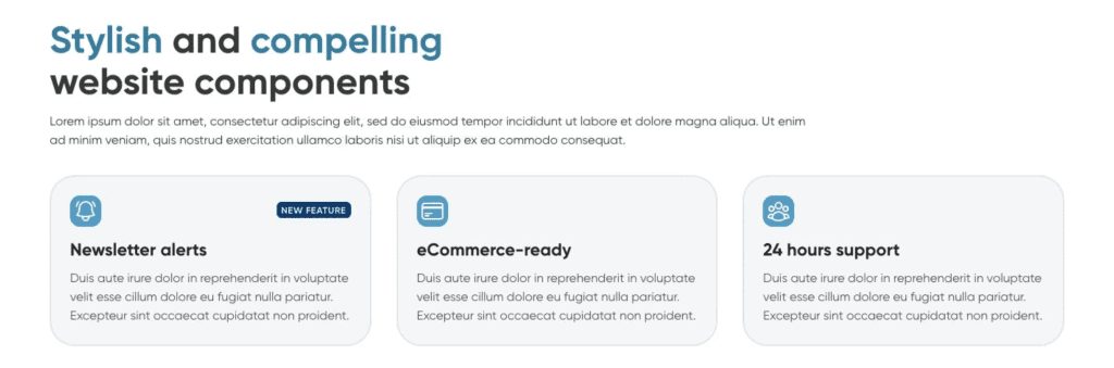
Notice the multi-colored heading, cards with an arbitrary border radius and border style, card background color, a badge with unique styling, and icons with matching border-radius.
All that styling has to be changed or removed before you can start styling the elements the way you want. It’s a lot of extra work, and we still need to look at the small details beyond the obvious.
For example, how is the spacing handled throughout the section and with each element? If the spacing uses bottom or top margins on each component, adjusting the spacing will consume even more precious time.
Where is the styling done? If it’s done at the ID level or with utility classes, it will be even more of a time suck.
Working with blocks like this is tremendously inefficient and unenjoyable.
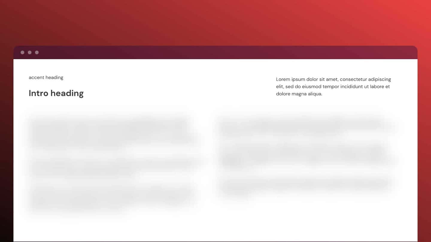
A Frames example
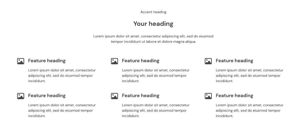
Frames aren’t sexy out of the box, but that’s not the point. The point is functionality and what’s going on under the hood to set you up for maximum efficiency, consistency, technical code quality, and ease of styling.
Aside from the obvious fact that there are no styles to undo, here are some other benefits you might not see at a glance:
- EVERY element has a consistent, BEM-organized class ready for styling, allowing you to style multiple elements simultaneously.
- Grids all use CSS Grid instead of less efficient Flexbox layouts.
- We take great care to ensure the DOM structure follows HTML5 and A11y best practices (I’ll talk about this more in a moment).
- Spacing is all controlled with gap and contextual utility classes that allow for global tightening and loosening control independently across content, cards, containers, and grids.
And that’s just one example. Many frames have insanely valuable “under the hood” features that you’ll never find in other design sets.
Frames is technically superior when it comes to HTML5 structure, accessibility, and best practices
If you’re considering a design set framework for serious website builds, you should care tremendously about code quality. Unfortunately, most competing design sets focus on the wrong things.
Notice they’ll talk a lot about how fast they release new blocks or the total number of blocks in their library. Why? Because those are the only points they seem to be able to compete on.
We’ve inspected the DOM for almost all major competing design sets and we still haven’t found an acceptable one, much less one that’s up to par with Frames.
Competitor DOM for Feature Cards
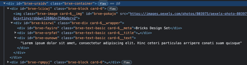
This DOM structure is a nightmare (and it’s certainly not the worst we found).
Here are all the points of failure:
- The “grid” container uses Flexbox, an inferior system for grid-based layouts and much more of a hassle to use.
- A list of features should technically be an HTML list with proper <ul> and <li> structure. None of that is present here – it’s just <divs> in <divs>.
- Headings should come first in the DOM for card elements for the best accessibility and structure.
- The image should be positioned first in the design using the order property. In this example, the image element comes first in the DOM.
- The cards have no heading at all. They only have <div> text styled like a heading.
- The image has no wrapper.
- The image is not contained in <figure> tag.
- Card body text should use paragraph tags for proper context. In this example, it’s left as a <div>.
- Pixel units are used to style elements instead of relative units.
And this is a SIMPLE example that should be easy to execute. The more complex these blocks get, the more horrific the DOM structure becomes across almost all competing design sets.
Frames DOM for Feature Cards
When you inspect the DOM for a Frames element, you see a completely different story.
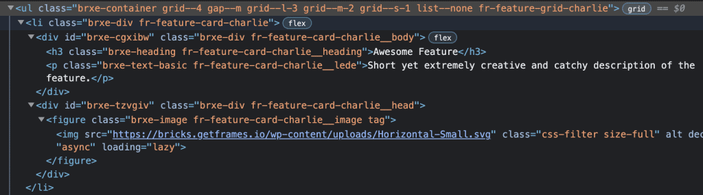
Key points:
- Proper <ul> and <li> list structure
- List container uses Grid instead of Flexbox
- All elements have design-ready, BEM-organized classes
- Heading (H3) comes first in the card element
- The image has a wrapper
- The image is contained inside a <figure> element
- The image wrapper comes first visually using the order property
- Card text uses proper <p> tag
- Elements are all styled with relative and responsive units
- Padding, spacing, text sizes, etc., are all automatically responsive via ACSS
This stuff matters!
It matters for accessibility. It matters for SEO. It matters for styling and development efficiency when working with block sets like this. And it matters for pride, overall quality of work, and further justification for your prices.
Let’s look at a more advanced example
Please stick with me for a moment because this is important. It demonstrates the level of thought and detail that goes into every frame.
Here’s Feature Section November:
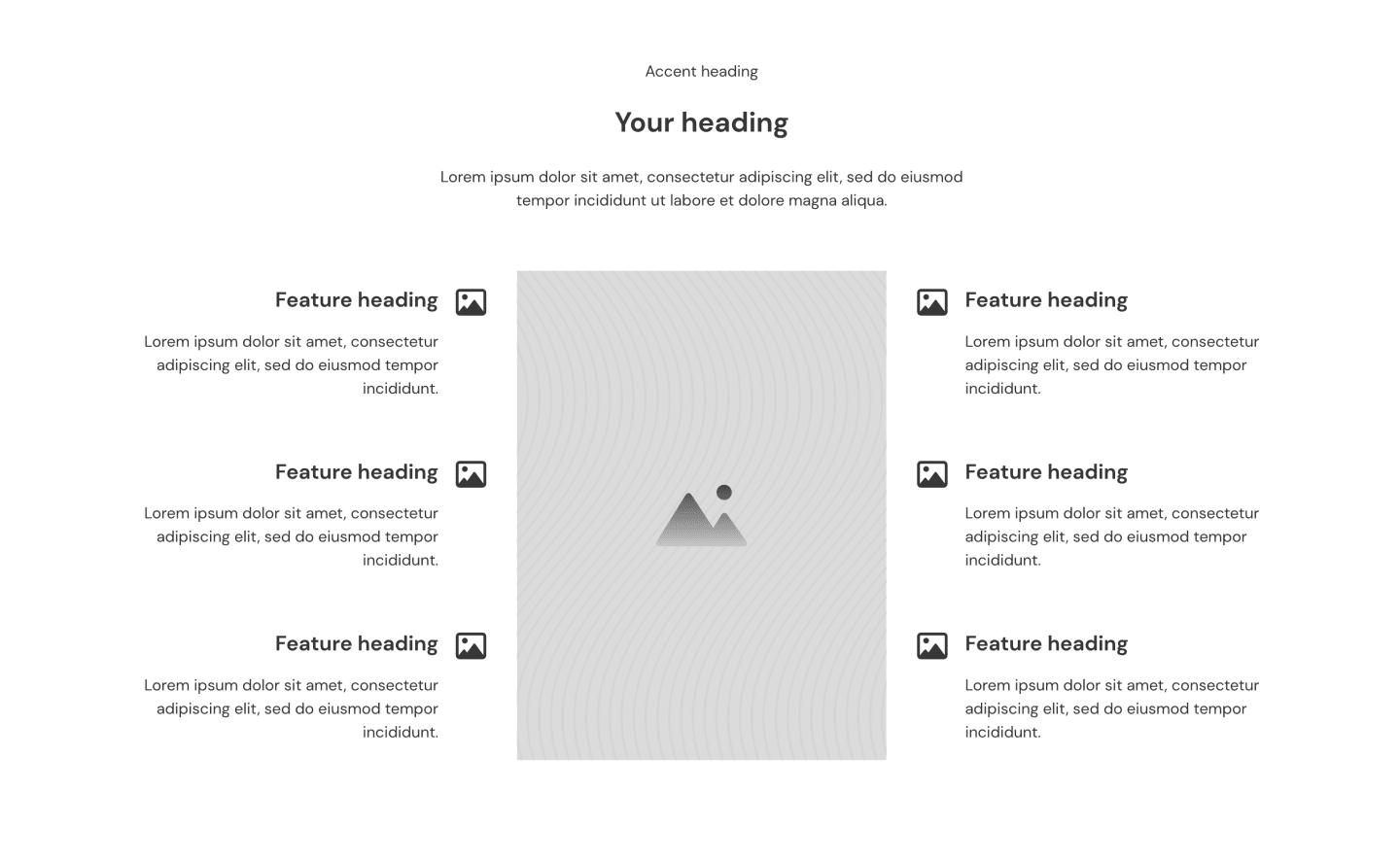
Just so you can visualize this properly, here’s a semi-styled version that took about 3 minutes to style:
How would you approach building a section like this? How would a competing block developer create a section like this?
Most block sets would create a three-column layout, stack one set of feature cards on the left, drop an image into the center, and then stack another set of feature cards on the right.
This method would certainly achieve the layout visually. Still, it would be an inferior technique concerning DOM structure, maintainability, and accessibility.
This layout presents a genuine challenge. To be appropriately structured, the feature cards need to be a list with proper <ul> and <li> structure.
Note that I said “a list.” Not multiple lists. You can’t build this with a list on each side. There needs to be one list for proper HTML structure and query loop compatibility.
In our experience, many users will want to query those feature cards with a loop. With two separate lists, you’d need two different query loops. And you’d need to configure the logic to ensure you’re not duplicating any cards with your query.
Lastly, the image needs to reside outside the list because it’s not part of the list of features.
When we built this section, we spent a ton of extra time and strategy making sure the DOM structure and layout were as efficient as possible. We could have whipped it up quickly like everyone else, throwing out all concern for best practices, but that’s not “playing to our standard.”
Take a look at this:
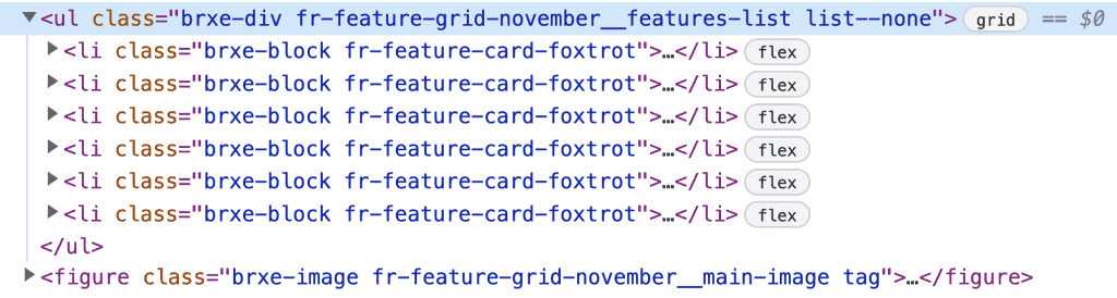
What do you see?
- Proper list structure
- One single list vs. having multiple lists
- The list wrapper doubles as the grid structure
- Image resides outside of the list structure
- Image has appropriate <figure> wrapper
And what you can’t see here is the grid magic that makes it all come together (while still being very easy to edit/adjust).
The result is achieving a specific layout visually while still having a clean DOM structure for your feature content. And it retains support for one single query loop.
You’re not going to find this level of best practices and attention to detail in any other design set.
Our Frames team is highly trained and follows a very tight SOP with documented standards for creating new frames. On top of that, no Frame ever gets published unless a separate team member has inspected and approved it.
Frames is built with BEM custom classes for maximum scalability and maintainability
I recorded an entire tutorial dedicated to BEM to try and help front-end developers improve their styling organization and maintainability:
While BEM is powerful, it takes time to implement. Giving every element a suitable class and logical name is slower than styling everything at the ID level or littering your elements with utility classes.
For example, a feature card with typical elements might need the following classes:
- .fr-feature-card-charlie
- .fr-feature-card-charlie__body
- .fr-feature-card-charlie__heading
- .fr-feature-card-charlie__text
- .fr-feature-card-charlie__media-wrapper
- .fr-feature-card-charlie__media
- .fr-feature-card-charlie__body
While this typically takes more time, arguing that it’s an inefficient strategy because it takes longer up front is a poor argument.
The reality is that BEM saves a tremendous amount of time later on when it’s time to scale and maintain the website. When you style at the ID level or use a utility-first methodology, you create a website that isn’t scalable or maintainable.
You can certainly build quicker the first time around with ID and utility styling. And in doing so, you create exponentially more work and inefficiency for the future.
But, thankfully, there’s no “take your time” issue with Frames.
When you add a Frame to a page, you can immediately start styling at the class level. All the BEM classes are already applied and organized for you. No extra thinking or consideration is required. And when you add that same Frame to another page, it’ll automatically look precisely the way you want.
We’ve also gone the extra mile to label every element in the structure panel properly, so you’re always clear about what an element is and how a frame is structured.
Frames is powered by ACSS for perfect consistency, responsiveness, and flexibility
There’s a reason AutomaticCSS (ACSS) is the #1 framework for WordPress page builders. Just as Frames differs from other design sets, ACSS differs from other frameworks.
ACSS powers the entire Frames library, so you have all the typical benefits:
- A unified color system with customizable shades and transparency options
- Fluid-responsive typography that’s mathematically scaled
- Fluid-responsive spacing that’s mathematically scaled
- Fluid-responsive section spacing that’s mathematically scaled
- Fluid responsive contextual spacing for content, grids, containers, and cards.
- Important accessibility features built-in
- A powerful variables library for custom styling
- CSS Grid with full support for 12-column grid
- Dual layer fallbacks for maximum browser support
- And more.
Where other design sets use whatever arbitrary values “seem to look good,” all base styling within our frames is done with ACSS variables. This makes the spacing, typography, and responsiveness consistent across the entire library.
Frames doesn’t brag about offering 10 versions of the same layout – each Frame is legitimately unique
Almost all design set products brag about having “2500+ blocks” or whatever the number might be.
While that sounds impressive, it’s pure marketing nonsense in most cases. If you look more closely, you’ll see the same basic layout shuffled around in various ways.
These design sets are doing a ridiculous “drag/drop/publish” technique where they take one basic layout (one “frame” in Frames) and create ten different “blocks” from it.
Here’s an example from a Webflow design set (but almost all of them do this):
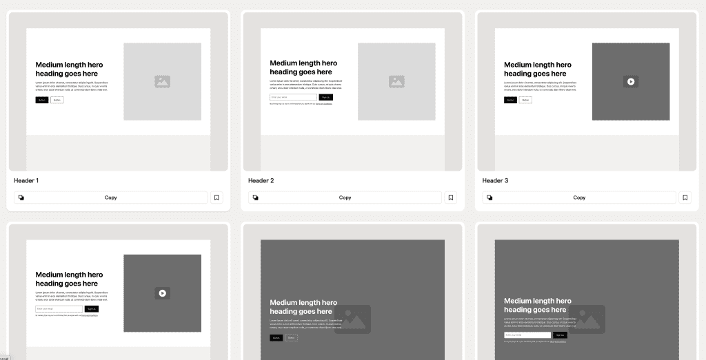
Header 1, Header 2, Header 3, and Header 4 are the same layout. The only difference is whether each block has an image, a video, button CTAs, or a form input.
We don’t do this with Frames.
Frames is built on the philosophy that you aren’t incompetent and don’t need your hand held. If you need to swap an image for a video, you can easily do that in the builder. You don’t need us to release another copy of the same Frame with a video placeholder instead of an image. And then another copy with a form input instead of buttons. And on and on.
The other benefit here is that when scrolling through the Frames library, you don’t have to wade through 10-20 instances of the same layout structure to find what you need. You can find a unique layout and quickly shuffle things around if needed.
Frames is modular – it’s easy to mix and match frames to get exactly what you need
The foundation of the Frames library are section frames. Section frames allow you to wireframe out a page section-by-section quickly.
This workflow is typical across all design sets.
Frames deviates from the competition in its modularity. A typical section has head/intro content, a main layout that is the focus of the section, and then often some call to action or social proof.
With Frames, we make each independent piece of the section an available frame in the library. For example, there’s a library of “introduction” frames to choose the exact intro heading/text layout you want for each section.
For example, you can have a center-aligned introduction:

Or you can have a left aligned introduction with a lede paragraph to the right:
Suppose the section contains a grid or image group. Those are also available as independent frames and can be swapped out or mixed and matched.
Here’s an example of an image group:

If the grid contains a card, it’s available as its own frame.
If the section contains CTAs or social proof, those are also available as independent frames.
Even elements as small as social icons exist as independent frames. Suppose you add a profile card that has social follow icons. In that case, you can swap out the icons for a different set if you like a separate set better.
Suppose you want a button and link combo CTA instead of a dual button CTA. In that case, you can easily exchange one for the other without having to choose an entirely different section frame.
The modular nature of Frames provides unprecedented flexibility over other design sets.
Frames includes a growing library of dynamic, accessible components
Developing quality websites requires more than just great layouts, sound design, and high technical standards. Most builds need more advanced functionality. Our goal is to provide that advanced functionality directly through Frames, so you don’t have to turn to other 3rd party tools.
The following are either currently in development or planned:
- Modal
- Carousel
- Accordion
- Toggles
- Tabs
- Content Switcher
- Menu
- Table of Contents
- And more.
You might think, “But many of these are available in Bricks or BricksExtras.” That’s true, but often the execution leaves much to be desired.
Additionally, essential factors like accessibility often get overlooked.
When these components exist in Frames you can use them knowing that we’ve coded them to the highest standards and that they’ll work seamlessly with Frames and ACSS.
Note: As of the publishing of this article, these components are still in development. Check the roadmap and changelog for progress updates.
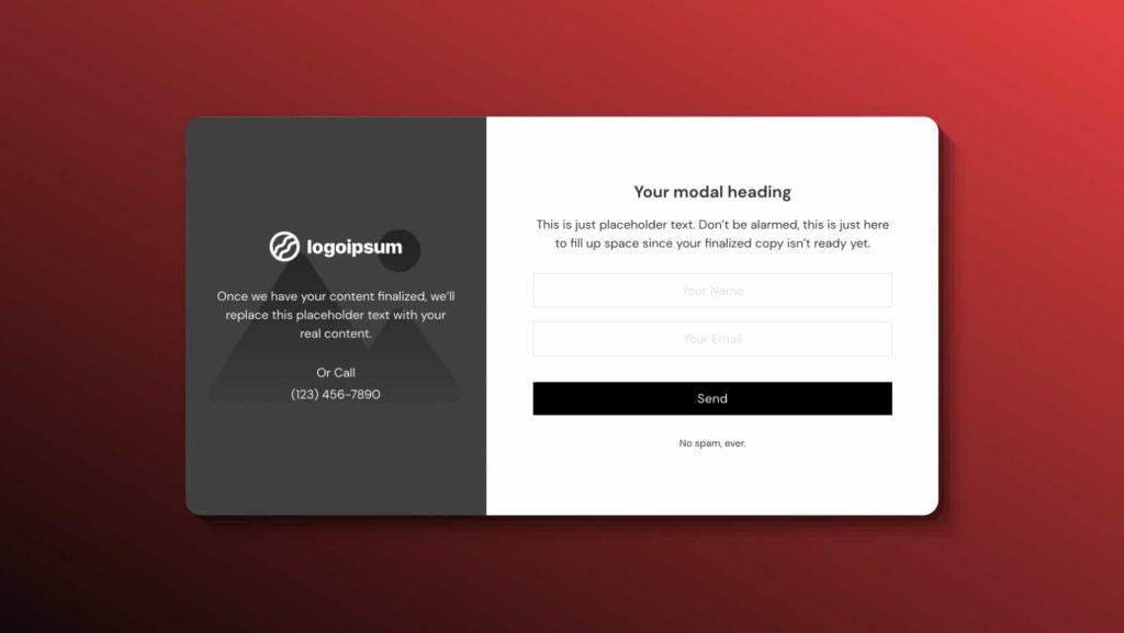
Not only are we creating dynamic, accessible components, but we’re also creating Frames that you can drop straight into those components.
Opt-in Modal Example
Menu Modal Example
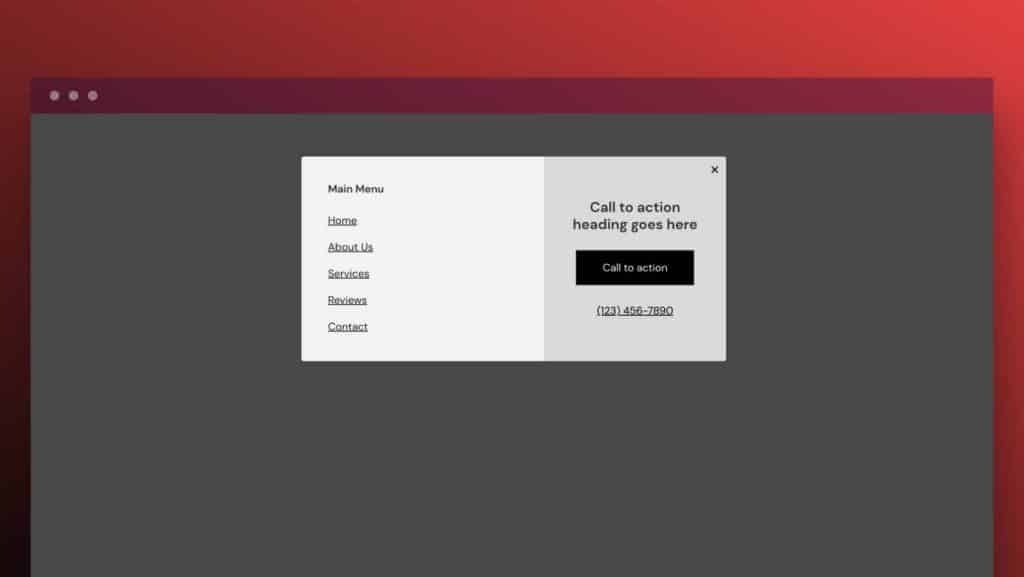
Do you know how much time these elements save on a website build just having these elements ready to go and ready to style?
Frames is platform agnostic just like ACSS
When I first created ACSS, I wanted it to be platform agnostic. You can use ACSS whether you use Oxygen, Bricks, Gutenberg, Zion, Cwicly, or even entirely outside of page builders and WordPress.
Not only that, but you can switch between platforms using the same plugin and the same license. No add-ons to purchase, no upsells, no nothing. One license covers you wherever you decide to build.
With Frames, this kind of situation is entirely different. It’s not a matter of tweaking the product to work on a new platform. Every single detail of every frame requires a complete rebuild from scratch. Every component has to be re-programmed to work on each new platform.
It’s a TON of extra work to make a product like this platform agnostic.
Still, we’re committed to the philosophy of one license, multiple platforms.
When you purchase a Frames license, you can take it to any supported platform. And as new platforms are supported, you’ll get access to those for no extra cost.
Frames is now the official foundation of the work we do at Digital Gravy
Looking at most design sets, you’ll realize they were created primarily as products for a specific market. The developers saw a need/desire in the market and went after that.
There’s nothing wrong with that, of course. That’s what you’re supposed to do as a product creator.
That’s not why we created Frames, though. Frames is not a product we built for the market; it’s a tool we created for legitimate agency work.
I wanted to create a framework and pre-design system that could fundamentally reshape our web design process at Digital Gravy. That’s why Frames is un-opinionated. We do 100% custom websites, so traditional design sets would never work for us.
We needed a flexible tool that would allow us to do three things:
- Wireframe directly in the builder
- Accomplish 75% of the quality dev work for us automatically
- Allow us to achieve custom designs without limitations
That’s what we designed Frames to do, and that’s why we now use Frames on every project.
This custom site design, for example, was 100% built with Frames and you’d never know:
Also, the fact that we use Frames in a legitimate agency workflow means we’re self-incentivized to continue improving it.
Our high standards for our agency work will never change. Thus the high standards for Frames will never change.
Our unending need for new and exciting layouts will always stay the same, so Frames will never get stale. Every time we create a unique layout, we’ll add it to Frames so the product remains fresh.
And, of course, our need for dynamic, accessible components with good user experience will never change, so those components will always be a priority with Frames.
It doesn’t matter if we’re making $1 or a million dollars from Frames – it’s a tool we need to do our work, and thus, we’ll always maintain it.
Can other design sets say that? If the money starts to dry up, will they still be around working diligently to make the product better?
None of us have a crystal ball, but I’d rather have a product used and needed by the people who created it versus a product designed purely for the market.
Wrap-Up
As you can see, there’s much to cover when discussing the differences between Frames and other systems. And really, this article could have been 10,000 words instead of 2500 – I tried to keep it somewhat brief without purely skimming the surface.
Let’s turn the question back to these other design set developers now. If you ask them what the differences are, what will they say? Will they have anything to say at all? Will they have any examples?
I’d like to know.
19 comments
Jérémy Franck
Thanks for the writeup, Kevin!
I bought because I knew all the love that went into the product and the tremendous value it brings, but I find it very pleasant to read a detailed account of what makes this such a high quality tool, without the content having a pre-sale, more marketing-focused angle (not to say your marketing feels salesy — it doesn’t — but this, to me, read more like a behind-the-scenes and under the hood look at the product).
It’s refreshing.
Derek Short
I love using Bricks, ACSS, and Frames together! It’s the best combination to increase my workflow speed and improve my website designs. I just bought the lifetime deal for Frames for Black Friday 2023. I’m so happy!
Kevin Geary
Thanks for your kind words, Derek!
Philipp Fischer
Started using Frames in September and already closing in on my 4th commercial project. Great product!
Kevin Geary
Thanks for your support Philipp!
Antonio Melgares
May sound like a web boomer, but I´d love to taste the Oxygen + ACSS + Frames combination
Keegan
This is without a doubt going directly into our workflow. I’m already loving Bricks builder. Frames and AutomaticCSS are the deal sealers for this being our new dev stack.
Thanks for the great product and the awesome YouTube content.
Kevin Geary
Love it!
Gerson
This is one of the best products for serious web designers and developers who care about accessibility and best practices in web development. I actually purchased the alpha before I even purchased Bricks. That’s how much confidence I have in you and in Frames.
Kevin Geary
Very much appreciated! Thank you 🙂
Dean
As a disabled accessibility consultant – who also designs websites…!
I can’t wait to get my hands on Frames and prove to people that accessibility isn’t a limiting factor and doesn’t lead to poor design.
Your commitment to accessibility and instilling good design practices to professionals gives me hope that I’ll be able to use more and more websites with assistive technology as time moves on – cheers!
Kevin Geary
Yes!!
Paul Harwood
Great article Kevin. In #7 you mention BricksExtras. I know you have used their elements and features for your website builds. Do you plan on developing similar components to those that they offer or plan to offer?
On the fence about purchasing BricksExtras (especially with the Black Friday deal) as some of what they offer looks like it’s on the roadmap for Bricks and now Frames.
Kevin Geary
Yes, the goal is that you won’t need other 3rd party tools. Frames should do all this for you!
Thomas
Thanks for this broad insights.
I have to admit, having focused on the wrong details for too long. I preferred the shiny looks over accessibility and standards.
Slowly, I manage to dig myself out of that grave. Now only my clients have to be persuaded to follow my lead 🙂
Kevin Geary
With Frames you can focus on shiny looks while we handle all the technical stuff under the hood 🙂
Amanda Lucas
Excellent article getting all the reasons down why Frames is so unbelievably awesome. It has been one of the best decisions I’ve made for my business and am excited to see its development and growth. I believe in the vision and concept behind the product and the fact that it makes me a more conscientious designer resulting in more accessible designs. Kudos to Kevin and his team 👍🏻
Kevin Geary
Yes! Thank you 🙂
kevingeary
Are these differences important to you? Sound off!