ACSS Tokens button component is a powerful component that offers a lot of flexibility and customisability.
How to access a link component?
To access our button component, go to the Figma assets panel and type “Button component”.
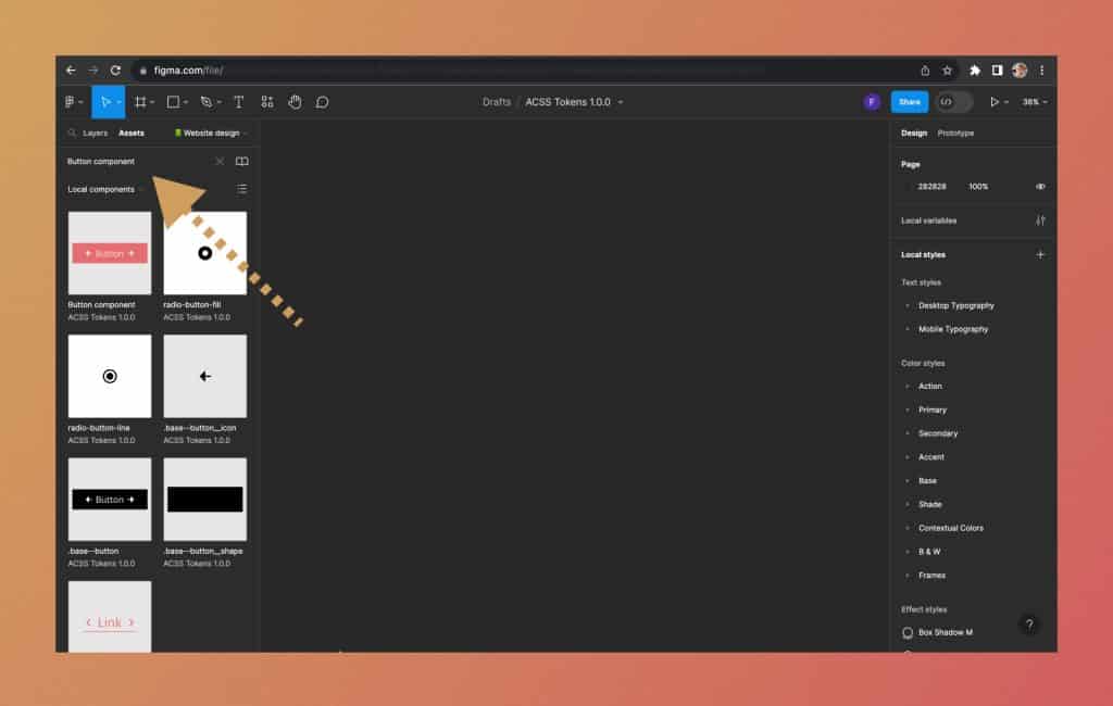
From there, simply left-click the Button component and drag it into your design canvas.
How to use button component?
When you drop a button component in Figma’s design canvas, you can see there are some options on Figma’s design canvas.

You can choose the following:
- Color
- Outline or non-outline state
- Default or a hover state
- Desktop or a mobile device
- Size
- Enable/disable button minimum width
- Show/hide left or right icons
- Show/hide text
- Edit the button text content
You can adjust your button to a desired state by playing with these settings.
How to change the button icons?
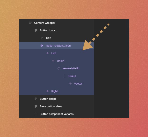
To change the link icons, first go to the button component page (Helper components > Button Component).
From there, you can see on top, that there are two icons.

On the left, there is an icon for the button’s left icon.
On the right, there is an icon for the button’s right icon.
To change any of those, please follow these steps:
- Select the icon instance you want to change, for example, left one:

- Select a layer with the icon name. In this example, we want to select a layer called “arrow-left-fill”:

- Then, on the Figma’s design panel, you will see a dropdown option for that icon:

- After you click on this, a list of icons will appear. You can choose any icon you want.

- For example, we will choose icon “arrow-left-up-line”. Once we do this, you can see that all of the buttons left icons have changed.


How to customize the button shape
Our button component allows you to change its shape.
For example, you can achieve something like this:

Or, if taken to extreme, you can even do some crazy stuff like this:

So, to customize the shape of your button, please follow these steps:
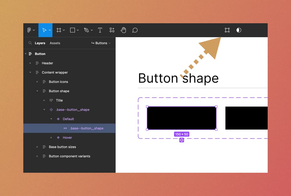
- Go to the Buttons page
- Locate the button shape section. You will see two black rectangles. Left one is for a default button state, right one is for the button hover state. Let’s say that for the sake of this tutorial, we want to adjust the default button shape.

- To select the button shape for a default state, we can press and hold ⌘ Command key (Mac) or Control key (Windows) and left click on black rectangle shape. This will select the right layer for adjustment, called “.base–button__shape”.

- With a correct layer selected, we need to select “edit object” mode. This can be done in two ways. First, you can locate the edit object icon in Figma’s utility bar at the top.

Alternatively, you can just simply press “Enter” key on your keyboard. This will enter edit object mode. - After you do this, you will notice small dots appearing when you hover with your mouse towards the edges of the button shape

- You can left-click any of those dots and move them around to create a unique shape.
- Once you are happy with the shape, simply press “Enter” key on your keyboard.
- As you can see, this shape is now updated on all button variations automatically.


How to customize the button specific ACSS Tokens settings
In addition to the above flexibility of customizing the button, ACSS Tokens allows you to customize it even more.
To access button specific ACSS Tokens settings, simply type “S btn”. All available settings related to the button will appear.
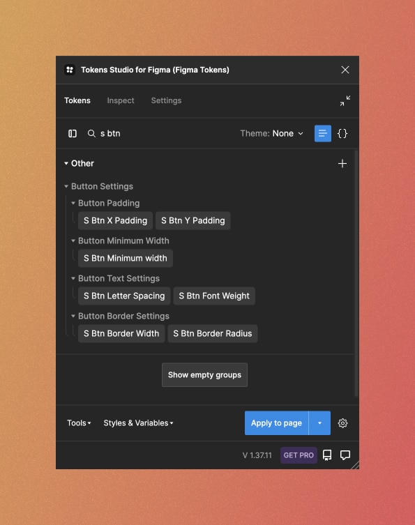
As you can see, you can adjust the following:
- Vertical and horizontal padding spacing scale value
- Button minimum width
- Button typography specific settings such as letter spacing and font weight
- Button border width and border radius
Let’s have a closer look to each of the setting.
Horizontal padding spacing scale value
ACSS setting token called “S Btn X Padding” controls the horizontal spacing (X-axis).
By default it is set to 1.5.
What it does, is that it calculates left & right button padding by multiplying its font size with spacing scale value.
For example, if we look at a button with a size M (medium):
- Its font size is 18px by default
- 18 x 1.5 = 27px
Therefore, left & right padding is set to 27 pixels.
Vertical padding spacing scale value
ACSS setting token called “S Btn Y Padding” controls the vertical spacing (Y-axis).
It is the same as the previous one, but this one adjust the vertical (top & bottom) spacing and by default it is set to 0.75.
So, for example, if we look at a button with a size M (medium):
- Its font size is 18px by default
- 18 x 0.75 = 13.5 px
Therefore, top & bottom padding is set to 13.5 pixels.
Button minimum width
ACSS setting token called “S Btn Minimum width” controls the minimum button width value.
By default, it is set to 200px.
What this does, is that no matter the size of a button (XS, S or M), it sets the button minimum width so that it can’t be smaller than 200px.
Button typography-related settings
You can adjust button typography as well. More specifically, you can adjust the button text letter spacing with a token called “S Btn Letter Spacing” or its font-weight with a token called “S Btn Font Weight”.
Button border settings
Often times you might want to adjust button border radius and button border width.
You can do this easily with ACSS Tokens called “S Btn Border Radius” and “S Btn Border Width”.
By default, border width is set to 2.5px.
Now, for the button border radius, you can also reference other ACSS Border radius tokens.
For example, if you try to edit the Button border radius token, you can write {Rounded M} in the input field.
What that does is that it references ACSS Border radius token.

Button Hover States
It is also important to note that ACSS Tokens Button component comes with hover states by default.
What this means, is that the prototyping is already done for you.
So, for example, if you preview your web design/wireframe in a Figma present mode and try to hover with your mouse on the button, its color/shape will change to the hover state automatically.
How to adjust button hover animation?
Go to the button page and select a main button component layer. Then, press enter. This will select all children layers (button variations).

Next, click on the “Prototype” tab in the Figma’s design panel.
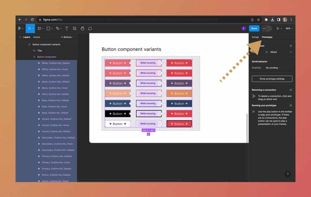
You will see there is a small section on top called “Interactions”.

Now, when you click on that interaction, a dialog menu will appear.
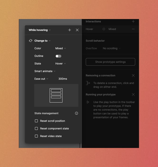
And here, you can change the animation settings for hover states.
For example, on top, you can see a dropdown “While hovering”. This is what triggers the interaction (e.g. change button color on mouse hover). You can change it to “On click” for example.
Next, you can play with the animation settings. Instead of “Ease out”, you can choose any other animation settings like “Gentle, Quick, Bouncy” or ever “Custom bezier”.
Also, you can change the animation speed. By default it is set to 300ms.