As we have explained on our documentation page “Style guide – Layout Grid”, Layout grid helps you to keep your content aligned within the maximum website width value.
It gives you a visual columns that indicates the maximum website width.
How to use a Layout grid?
Let’s look at an example of how you can add a display grid to your custom sections.
In the image below, you can see that we have a section with an inner container inside. We have applied ACSS Token called “D Website width” to our Inner container.
For better demonstration, we applied a blue border to our inner container.
We have also applied top & bottom padding by applying ACSS spacing token called “D Section space M”.
Additionally, we also applied a token called “D Section side padding” to the left & right side of our section.

Now, to add our Layout grid, all we have to do is with our section selected, locate a “Layout grid” option in Figma design’s panel like on the image below.

From there, click on the four dots icon. A small dialog menu with layout grid style will appear. You will be able to choose a Desktop grid or Mobile grid.

Now, when you select “Desktop grid for example”, you can see vertical lines from top to bottom of our section like in the image below.

This is great because, whenever we would want to position something in our section, we have a visual clue on what the website content width is.
A real use-case scenario would be, if you would want to position an element with an absolute position inside the section. Since you can move that element freely, it is easy to position it outside of the website content width area.
But since we have a layout grid enabled, we can see exactly where we need to position this element so that it doesn’t overflow the website content width.
How to enable/disable layout grid?
You can enable or disable a layout grid by pressing a keyboard shortcut “Shift + G”.
How to edit the layout grid?
To edit a layout grid style, click on a blank spot on your design canvas. Next, on the right side of a Figma design panel, you will see a list of Figma local styles.
Scroll to the bottom to see “Grid styles”.

You will see layout grid styles for desktop and mobile. If you hover over with your mouse on any of those, you will see there is a edit icon.
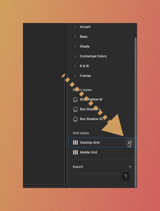
A small dialog menu will appear. From there, click on the properties icon at the bottom left corner.

This will open another dialog menu where you can finally adjust the layout grid style.

Now, for the settings, we recommend you to leave it as it is.
There are some cases where you would want to adjust the color of the layout grid’s columns.
Also, if you change the horizontal section padding ACSS Token from a default value of 60px to something else, you would want to adjust the Margin value of a layout grid style to the same number.
For example, if you change the value of the ACSS Spacing token called “D Section side padding” to 100px, you then also need to change the Margin value of the desktop layout grid style to 100.